Warden Protocol
A brand built for machines. Made by people who care.
Service
Visual Identity, Logo design, Website, Motion design
Industry
Layer 1 Blockchain, AI agents, DeFi, Omnichain, Web3
Stage at the time of consulting
Early stage
+234k
people who know the Warden Protocol brand
Brand awareness
People that worked on it
- Raffaello Cuccuini — Art Director & Graphic Designer
Warden Protocol is a modular L1 blockchain built for AI-driven, omnichain applications. At its core, it lets developers deploy autonomous AI agents that can trade, research, execute across protocols, and interact with DeFi — without human intervention. Today it's positioned as one of the leading AI agent projects in Web3, with an agentic wallet product that makes onchain activity accessible to anyone.
SBERLA shaped the brand from launch — logo, visual identity, web, campaigns, motion, and a bespoke NFT collection — and has continued evolving it as the project has grown.
The Brief
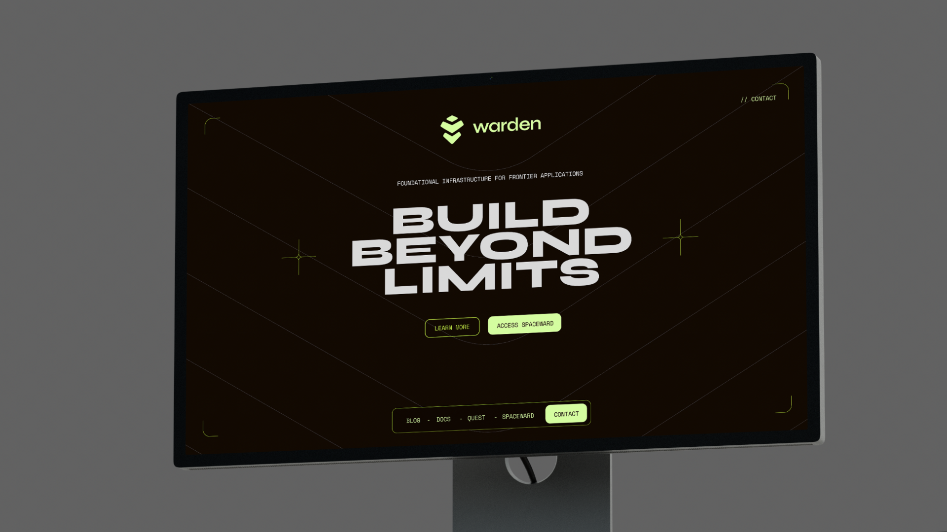
Unlike the other projects in our portfolio, Warden came with a clear personality already embedded in its name. A warden is a guardian, a protector, a keeper of order. The brief was to express that — something unambiguously tech, built for developers and the crypto-native crowd — but with character. Not just another dark-mode blockchain brand with a forgettable mark.
The name had to do more work than just sound good.
The Thinking
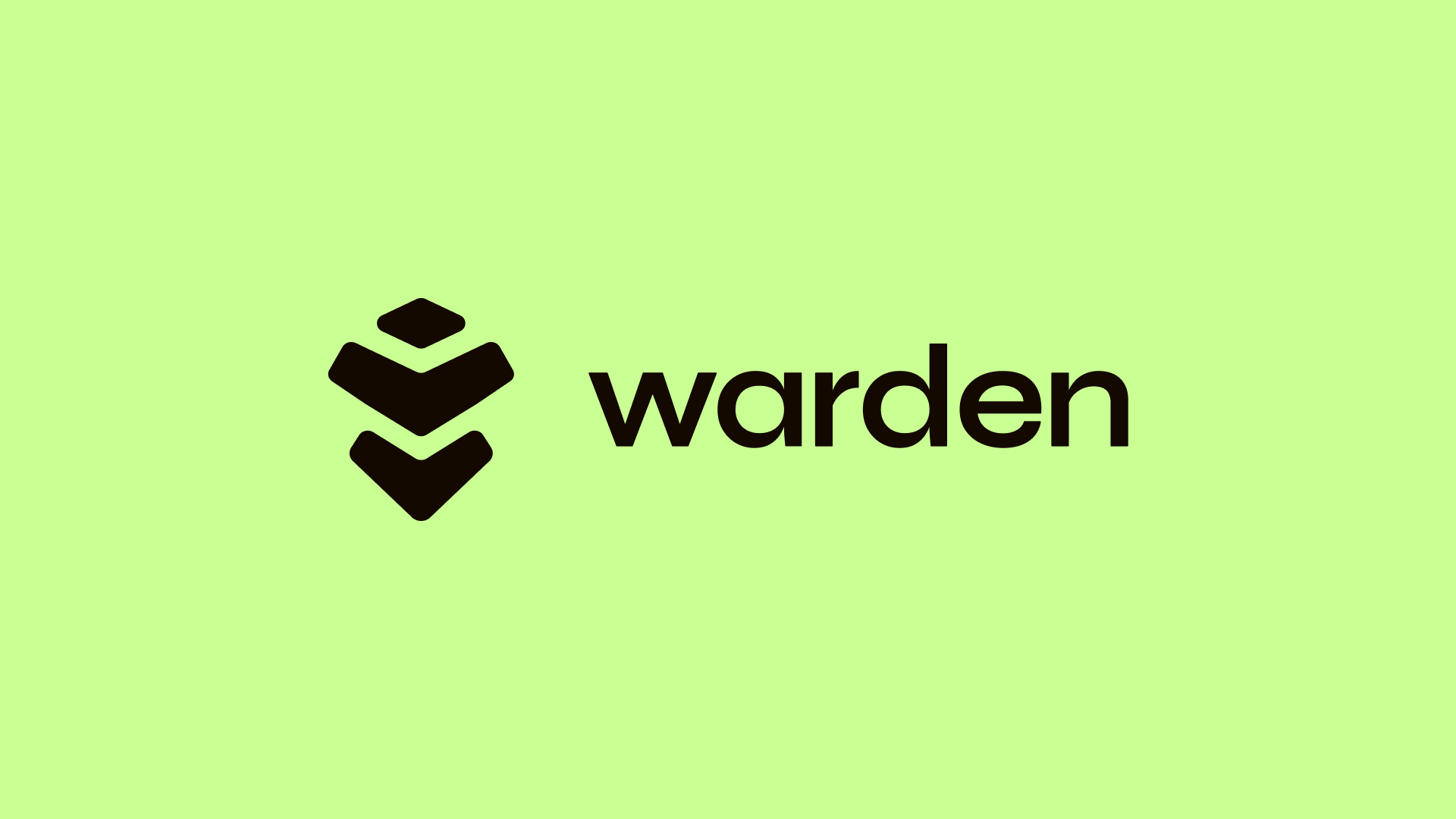
The logo became the creative anchor for everything that followed. The challenge: design a pictogram that could simultaneously evoke a knight's helmet — protection, guardianship, the warden — and the layered architecture of blockchain infrastructure, referencing L1, L2, L3 stacks that developers live and breathe.
The result is a mark that reads two ways at once. Front-on, it's a helmet — structured, bold, defender-like. Looked at differently, it's three descending layers, each one stacked on the last. Neither reading overwhelms the other. The logo earns its meaning without explaining it.
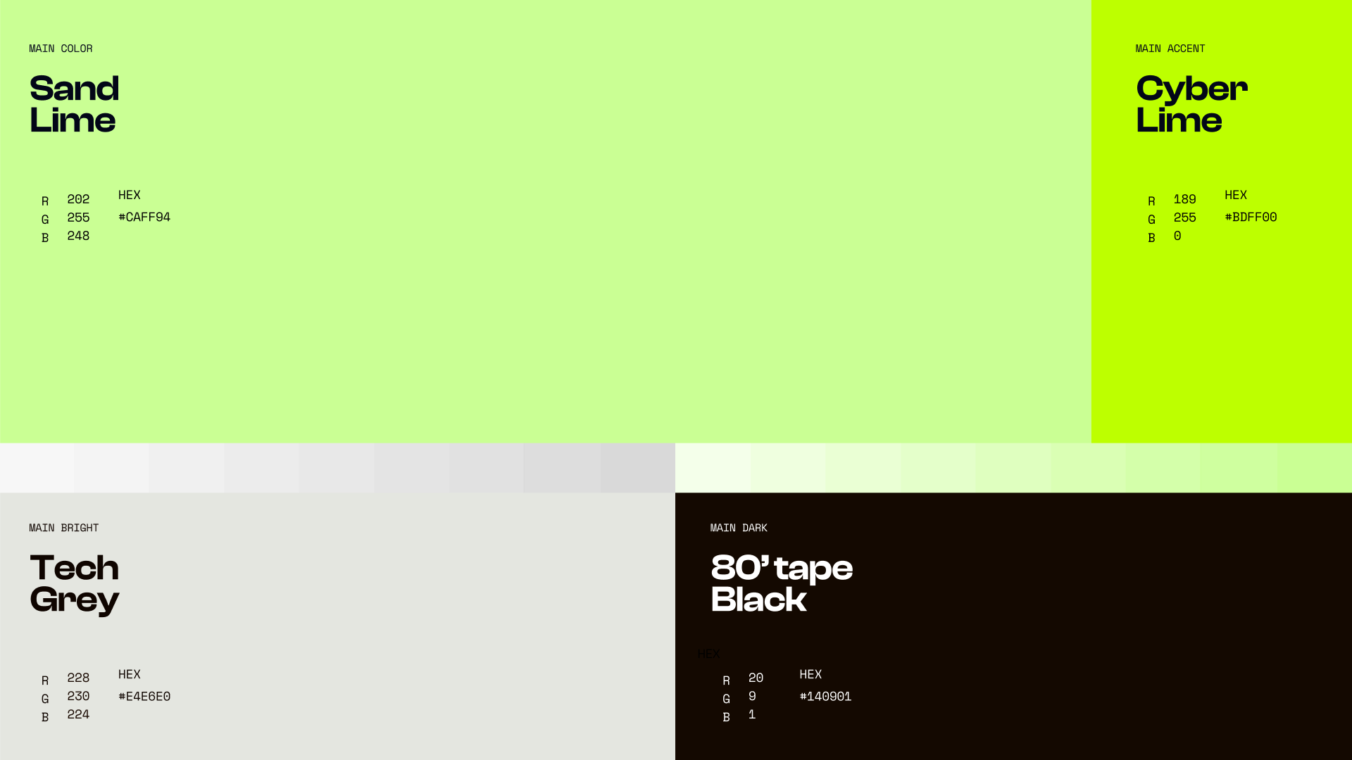
For the colour palette, we resisted the obvious. The standard tech playbook — cold black, electric blue, sterile white — felt too expected for a project with Warden's ambition. Instead, the dark base tones lean warm, pulling toward brown, with the texture of old VHS tape rather than cold metal. Against this, the accent green sits in a precise zone: lemony rather than neon, with just enough restraint to feel considered. The contrast does the work without screaming.
The result is a tech identity that looks immediately familiar to the right audience — and just different enough to be remembered.
The NFT Collection
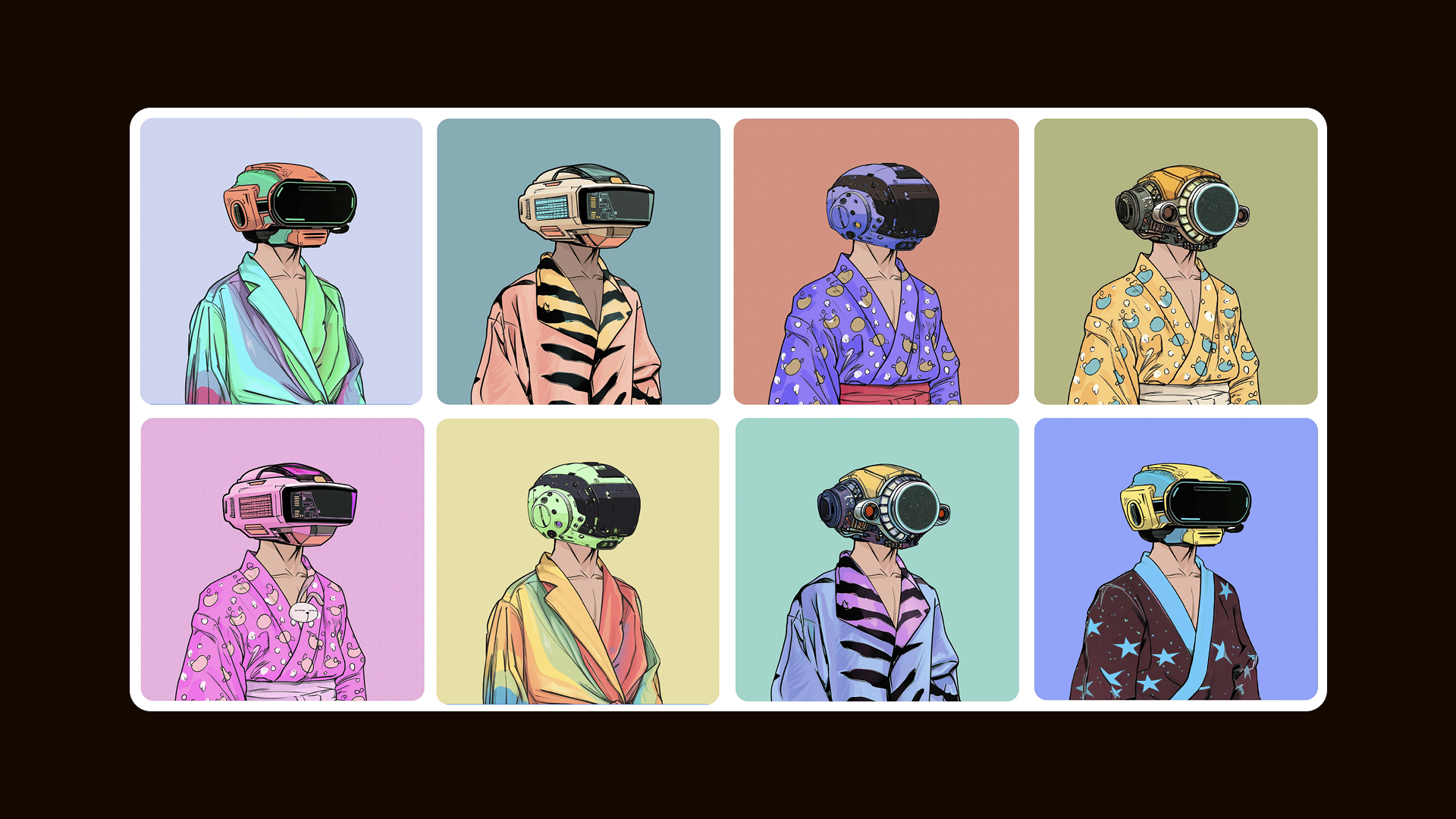
Warden's own slogan — "The blockchain that isn't for humans" — handed us a creative brief on a plate.
The NFT collection takes that line literally and turns it into something warm and funny. The characters are completely ordinary people: everyday clothes, casual poses, the kind of figures you'd walk past on the street. But where a face should be, there's a robot head — clearly an android, clearly an AI agent, entirely at ease in its human context.
The juxtaposition is the whole joke, and the whole point. These are the agents: not threatening, not dystopian, just quietly going about their business in human clothes. It made Warden's fairly abstract technical proposition tangible, collectible, and genuinely fun — giving the community something to hold onto beyond the whitepaper.
What We Delivered
Full brand identity including logo and mark, colour system, typography, brand guidelines, campaign assets, web design, motion, and the NFT avatar collection.
Outcome
Warden Protocol has established itself as one of the top AI agent projects in Web3 — a space that barely existed when the brand launched, and is now one of the most competitive arenas in the industry. The identity has held its own through that growth, remaining recognisable and coherent as the product evolved from a developer protocol to a consumer-facing agentic wallet.
A brand built for a blockchain that isn't for humans. Made, unmistakably, by humans who care about craft.
“If you're looking for someone who can truly reimagine a brand, Raff is it. His work for us was outstanding! He delivered a fresh brand turn that helped us reach over 20M users. The colours and icon he created are memorable and have become core to who we are. On top of the talent, Raff takes feedback exceptionally well and guided us exactly to where we wanted our brand to be. Can't recommend him enough.”

Luis Vaello Garcia
Founder & COO at Warden Protocol
Related projects
Humanity Protocol
We guided Humanity from an early-stage startup to a fully funded, mature unicorn company
Everything
Everything needed a slap. We were happy to help.
BasedAi
BasedAI needed a brand as serious as their ambitions. We built it.
Nerwo
We built the home for Web3 freelancers. From the name up.
Slophy
Slophy didn't need a brand. It needed a universe. We built both.