Humanity Protocol
A three year journey reshaping the internet trust layer.
Service
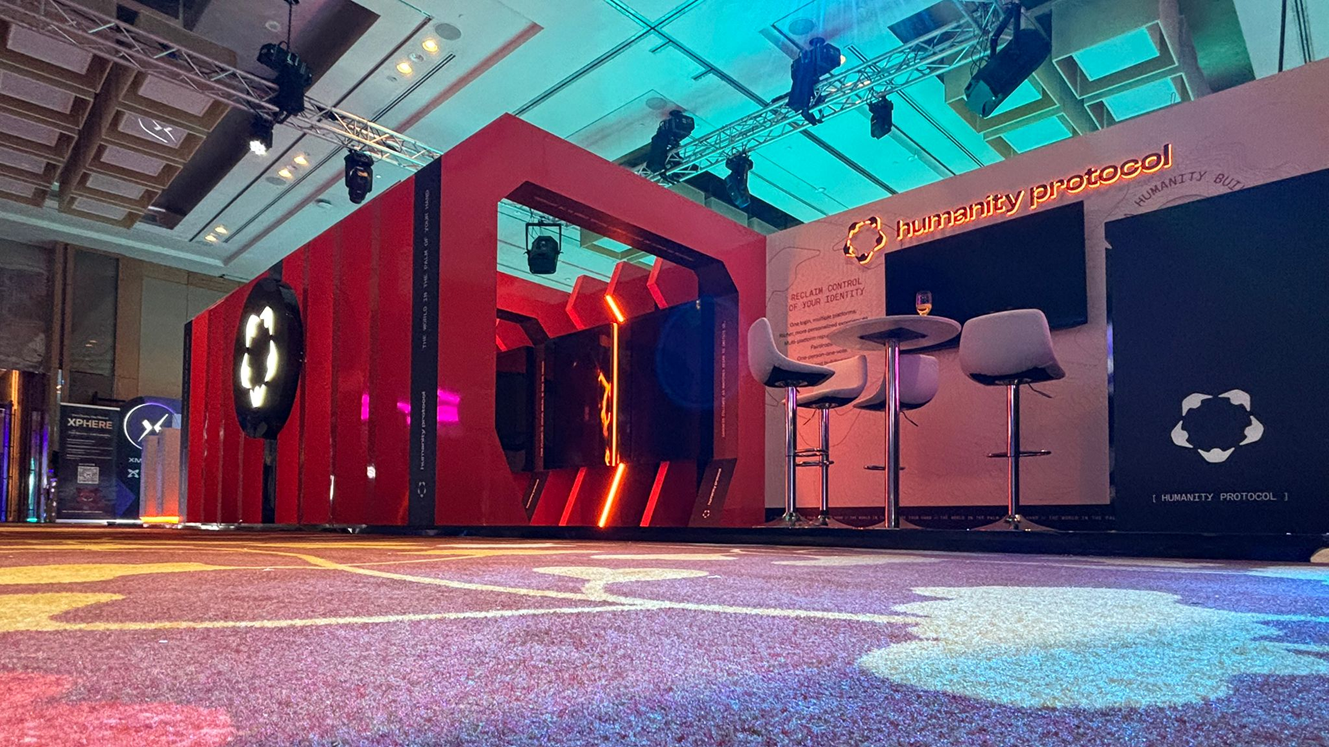
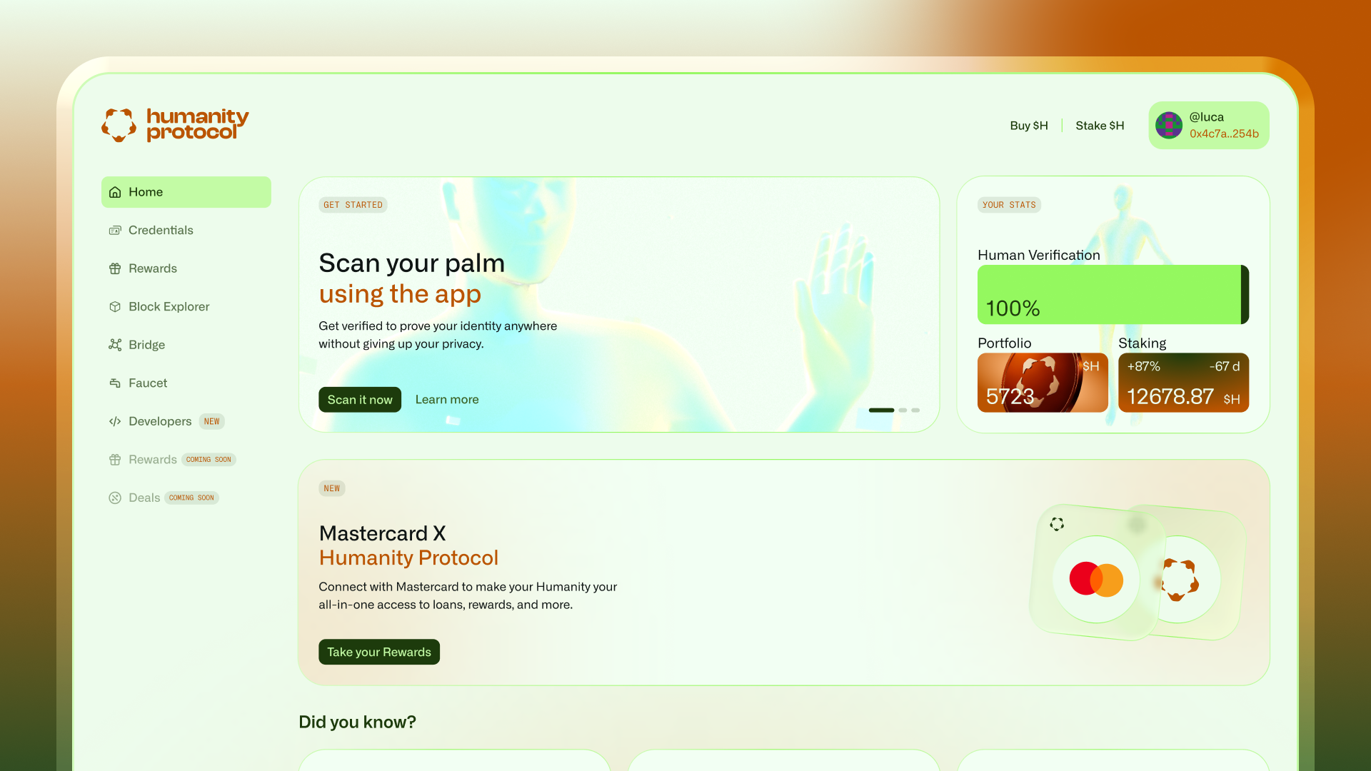
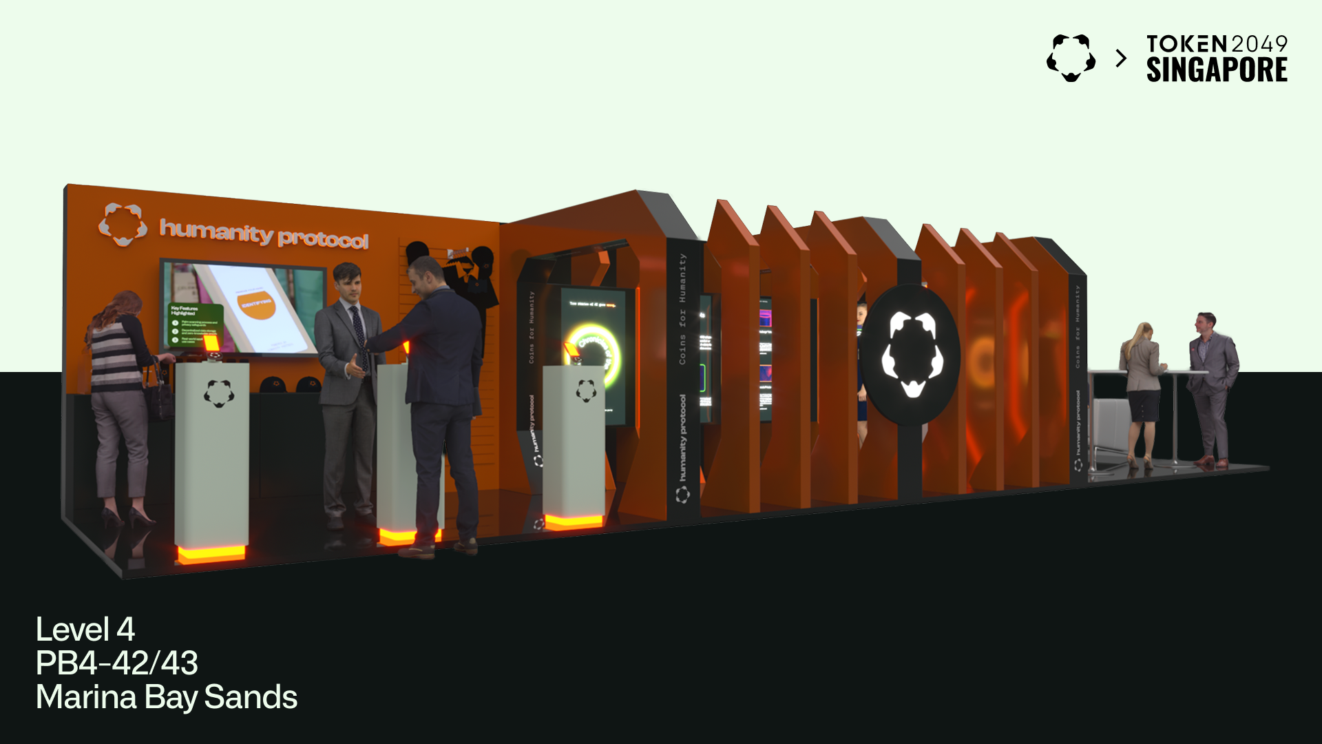
Brand identity, Website, Clothing design, Coin design, Booth design, Motion design
Industry
Digital identity, Web3
Stage at the time of consulting
From early stage to growth
+180k
increase in followers since we started to build the brand
Brand awareness
People that worked on it
- Raffaello Cuccuini — Art Director & Graphic Designer
- Luca Gabino — Graphic Designer & UI/UX Designer
- Ivan Rossi — SEO Specialist
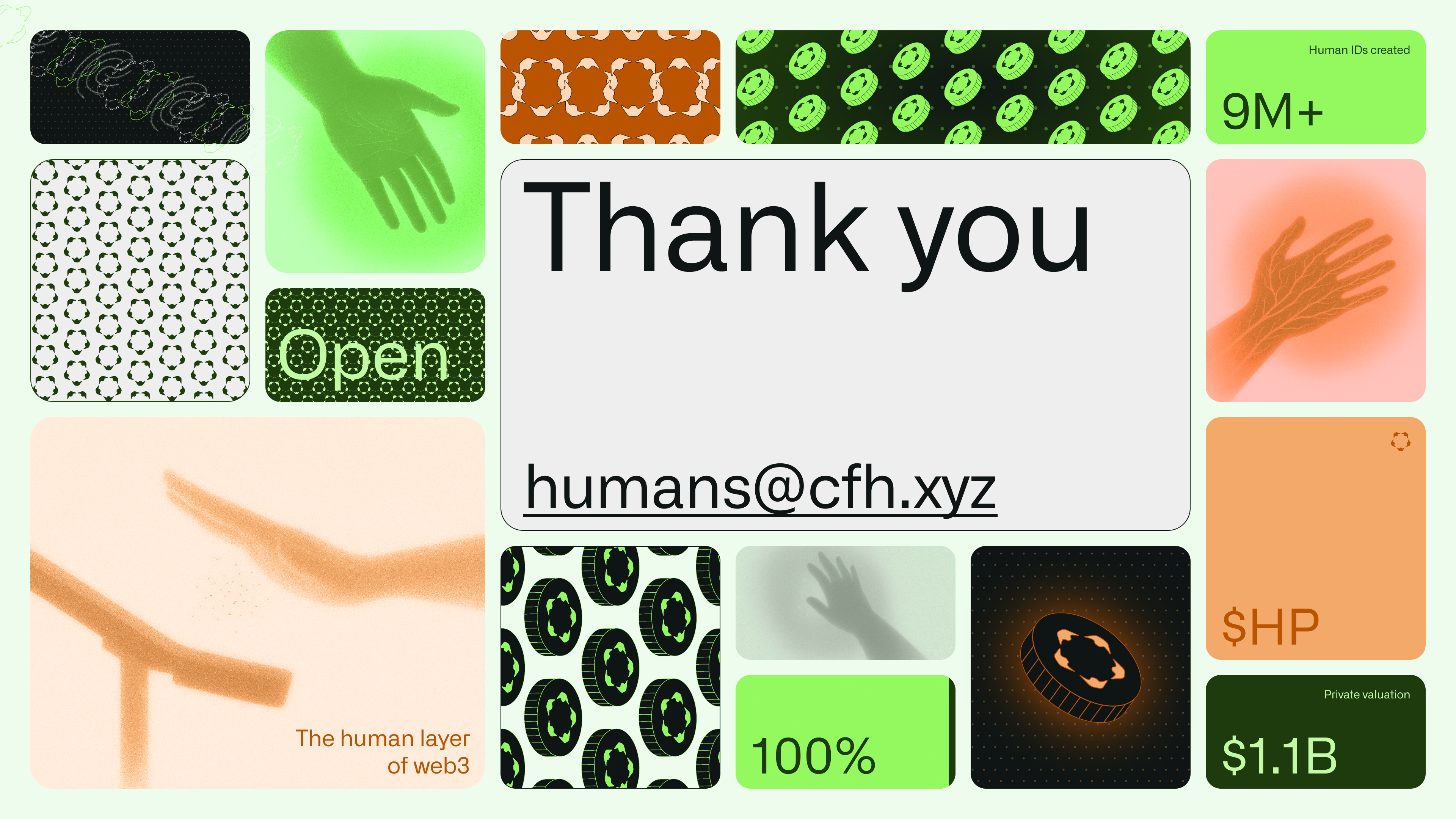
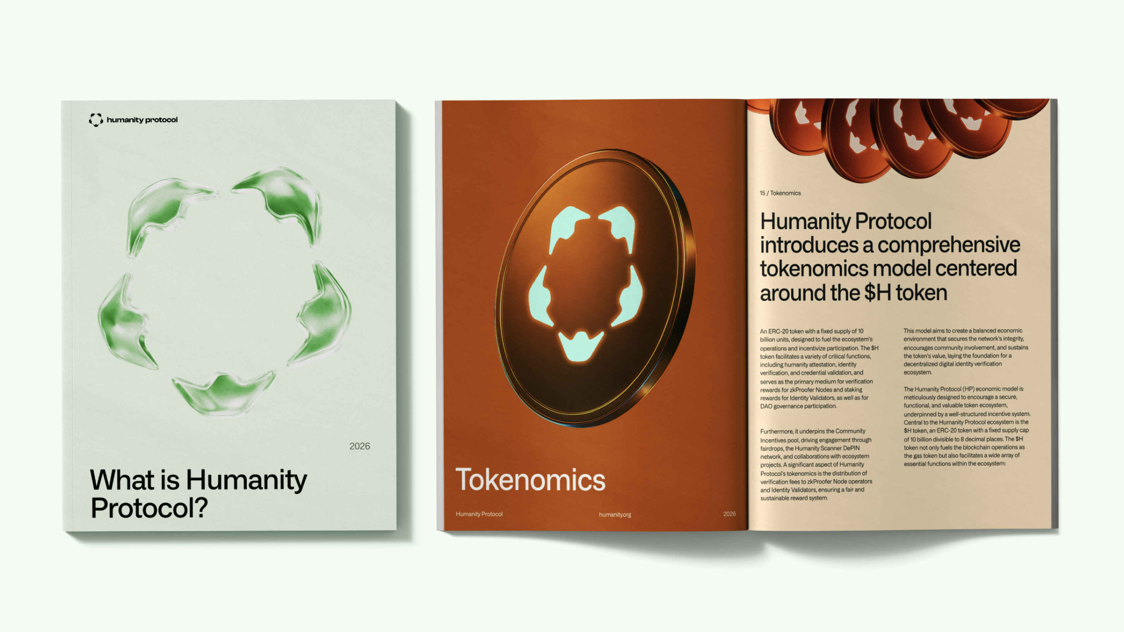
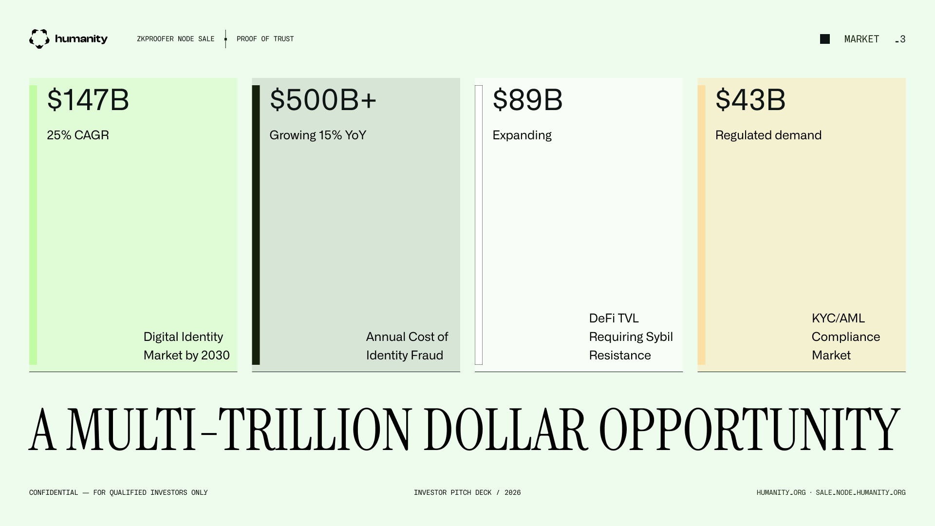
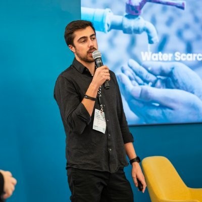
Humanity Protocol is a blockchain-based digital identity platform that lets users prove who they are without giving up their data. Using zero-knowledge proofs and palm biometrics, it enables individuals and organisations to verify identity, prevent fraud, and build trust without ever storing sensitive information. Today it counts over 8 million Human IDs created and integrations with 25 global brands.
SBERLA has been the creative partner behind the brand since day one, shaping its visual language from the very first mark, and growing alongside the company as it evolved from early-stage startup to institutional-grade protocol.
The Brief
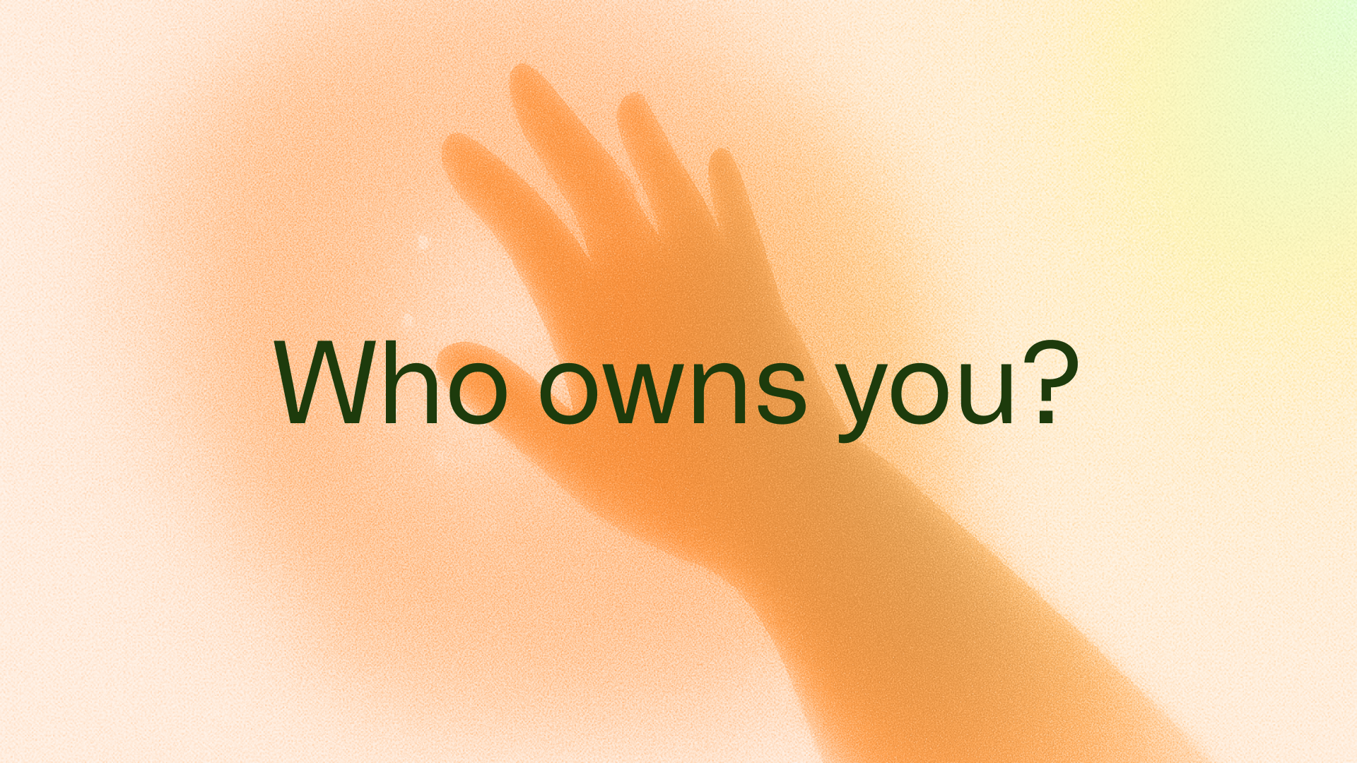
The challenge was clear from the start: build a brand that feels native to Web3 and resonates with crypto-savvy early adopters — but without falling into the tired visual tropes of the space. No cold blues, no generic circuit boards, no dystopian chrome.
There was also a deeper tension baked into the product itself. Humanity Protocol sits at the intersection of biometric technology and human rights, of cryptography and community. Too technical and it risks feeling surveillance-adjacent. Too human and it loses credibility in the crypto space. The ask, in essence, was: make something that hasn't been done before.

The Thinking
The creative foundation came from an unexpected place: Solarpunk — a literary and artistic movement that imagines a future where technology, humanity, and nature coexist in harmony. Not the cold, extractive tech of today. Not a dystopian warning. A genuinely optimistic vision of what comes next.
This framing gave the brand its emotional north star — technology as an extension of humanity, not a replacement for it. It resolved the tech/human tension without forcing a choice between the two.
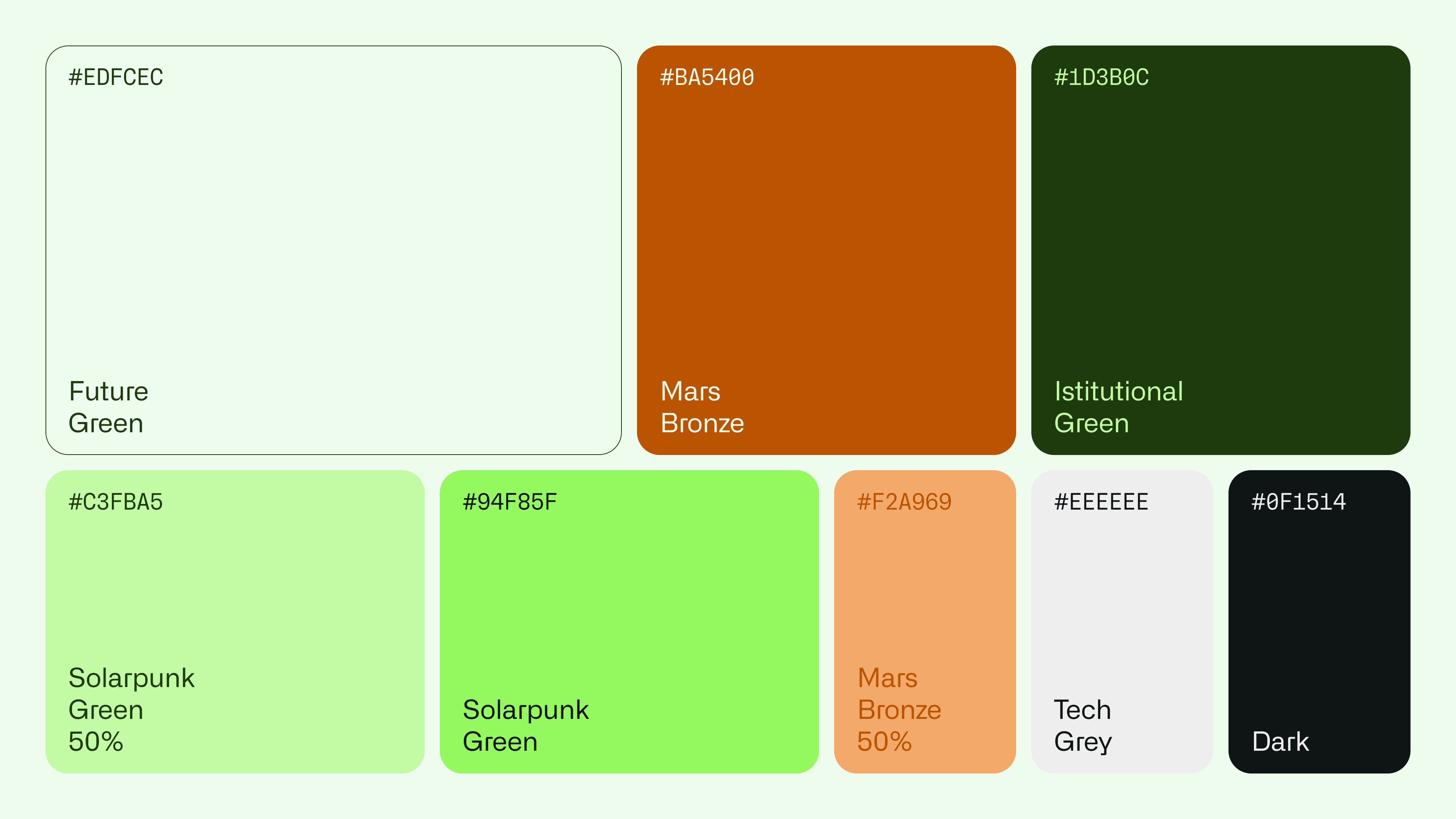
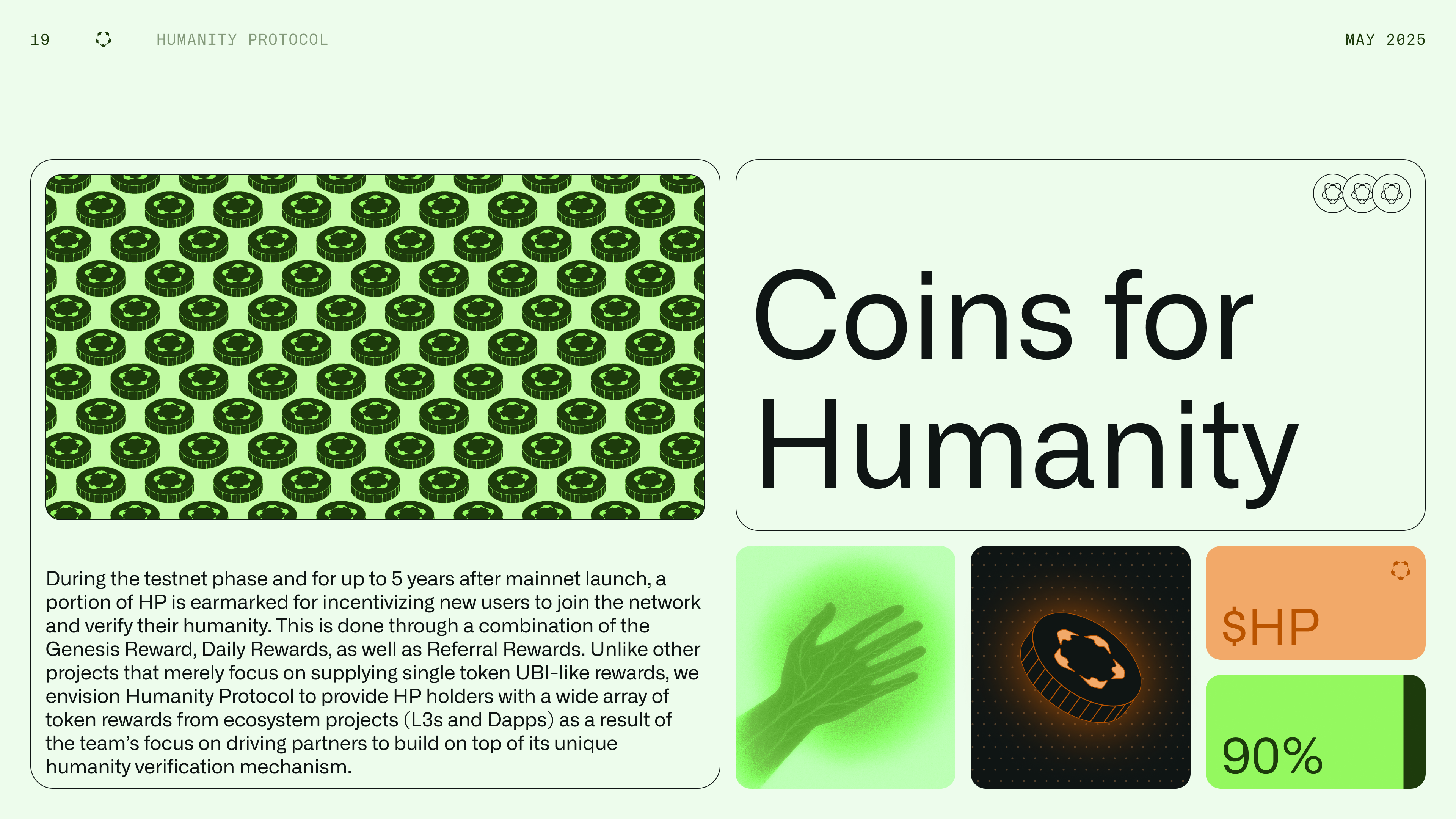
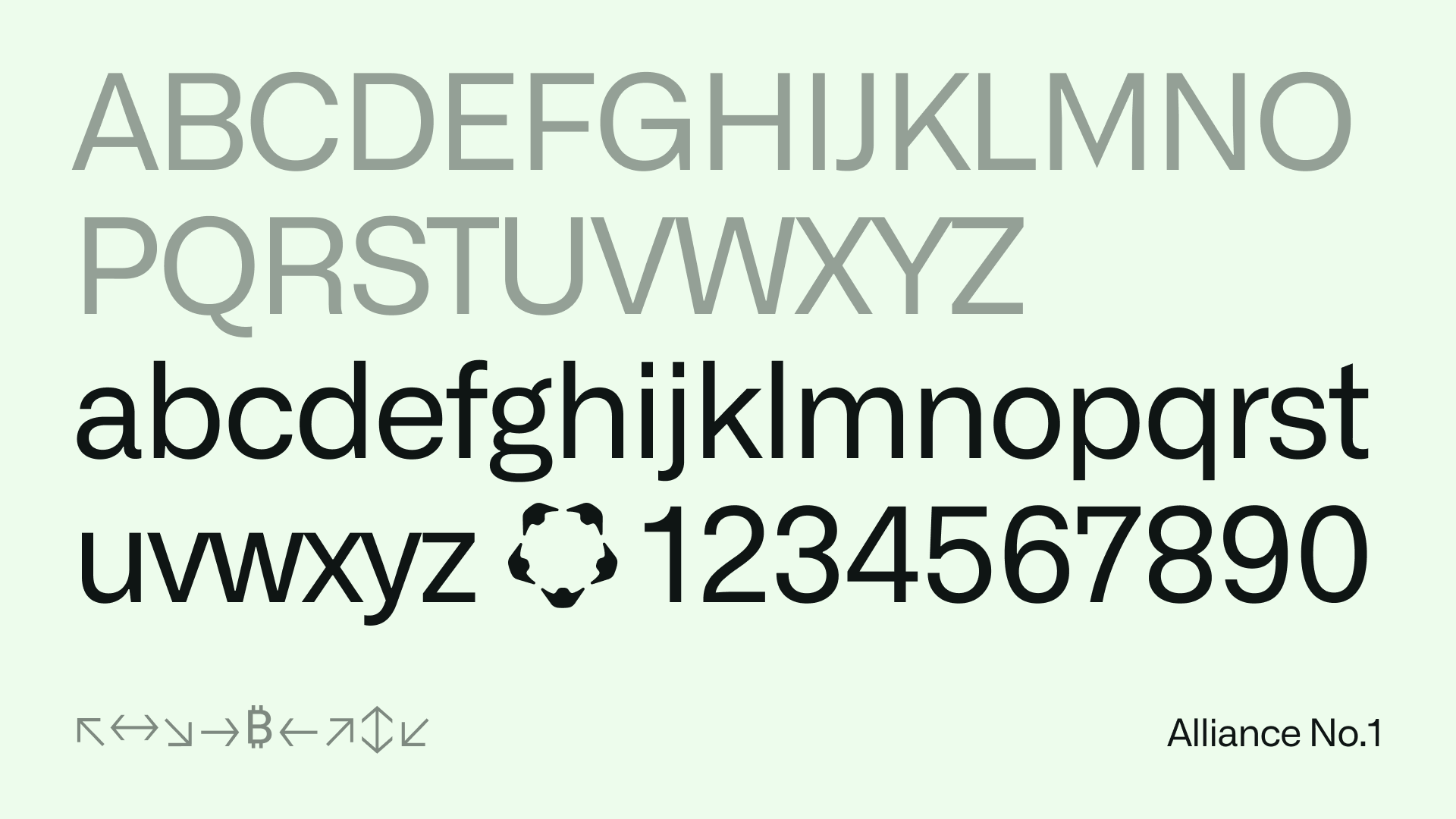
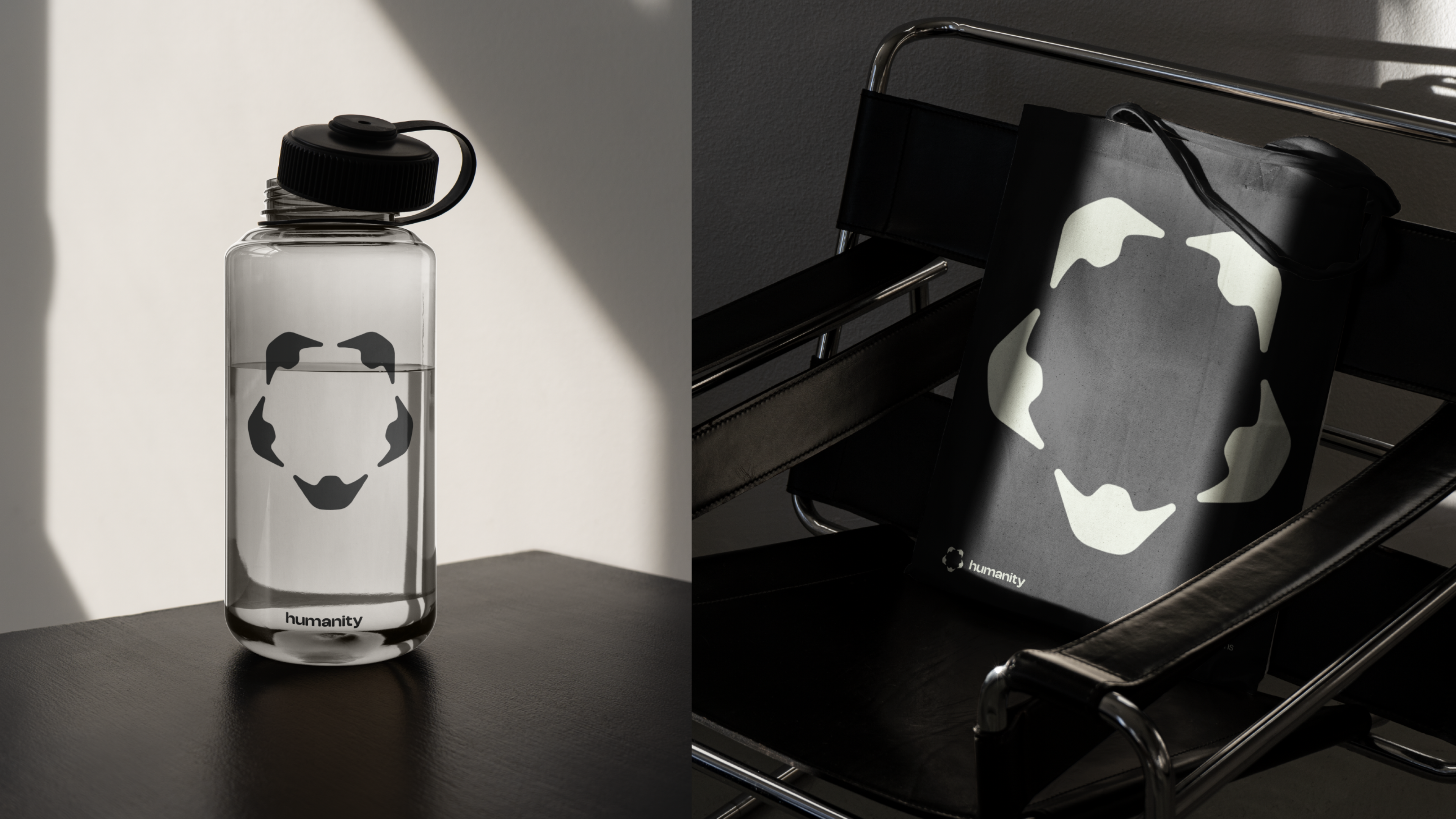
From there, every visual decision followed naturally. The colour palette broke away from crypto convention: warm bronzes and organic browns grounded the brand in something natural and tactile, balanced with a touch of acid green that kept one foot in the digital world. The result was a palette that felt alive — not sterile, not cold, not like anything else in the space.

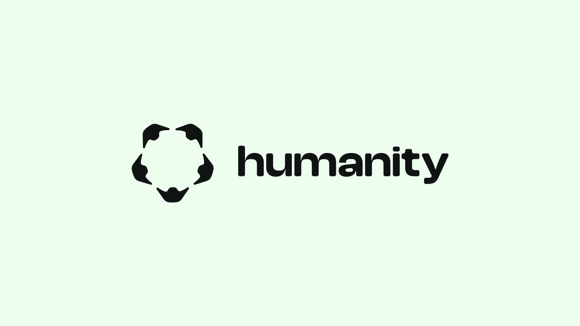
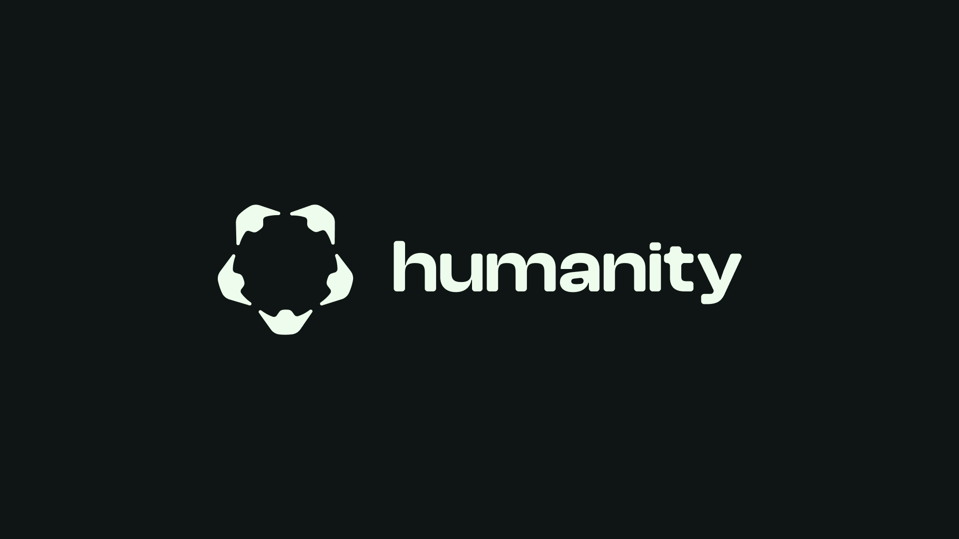
The Logo
The logo was perhaps the most interesting problem we worked through together. The concept: five humans holding hands. On paper, it sounds like exactly what you'd want to avoid — generic, sentimental, the kind of gesture that belongs on a charity poster rather than a crypto protocol.
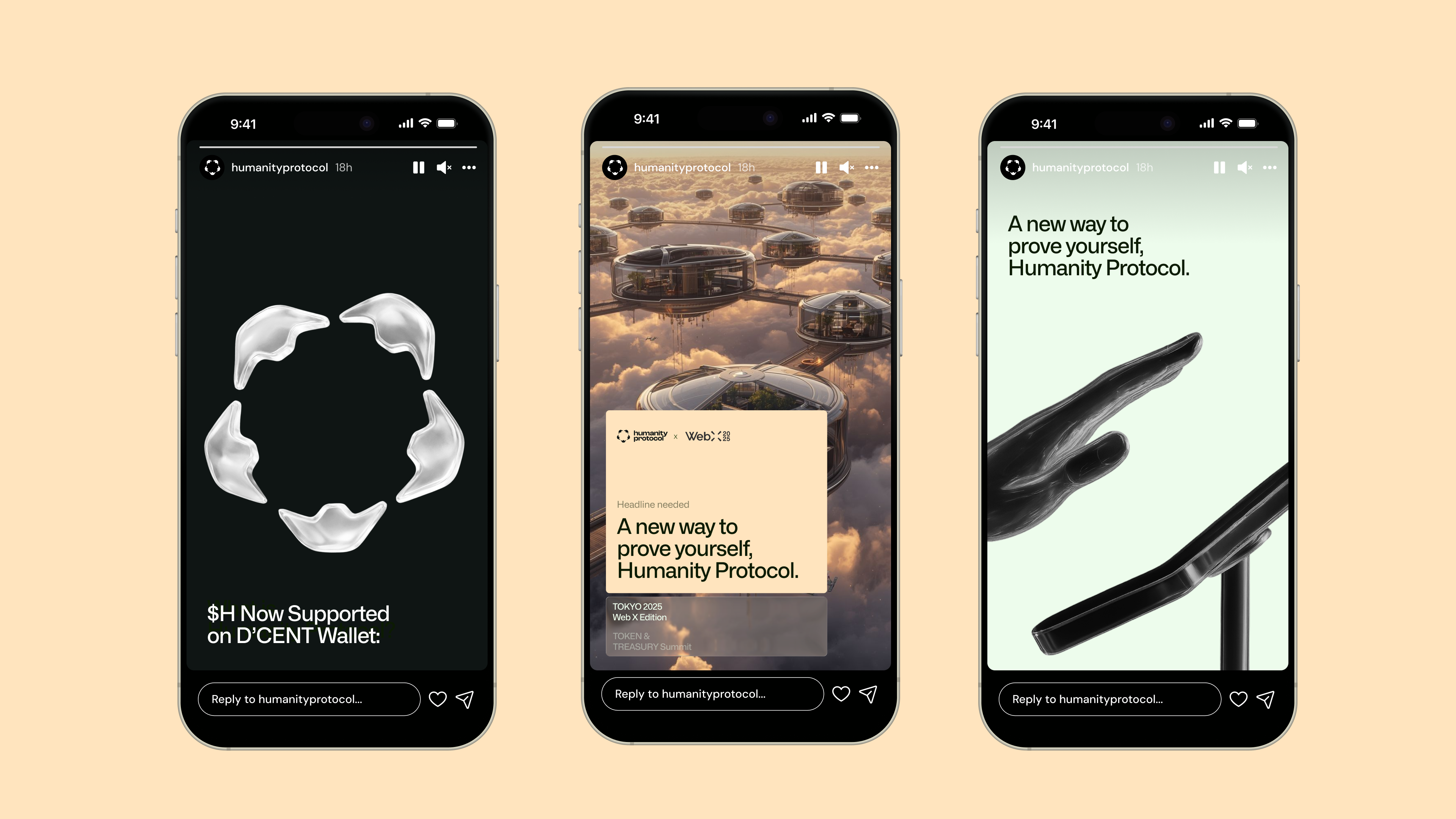
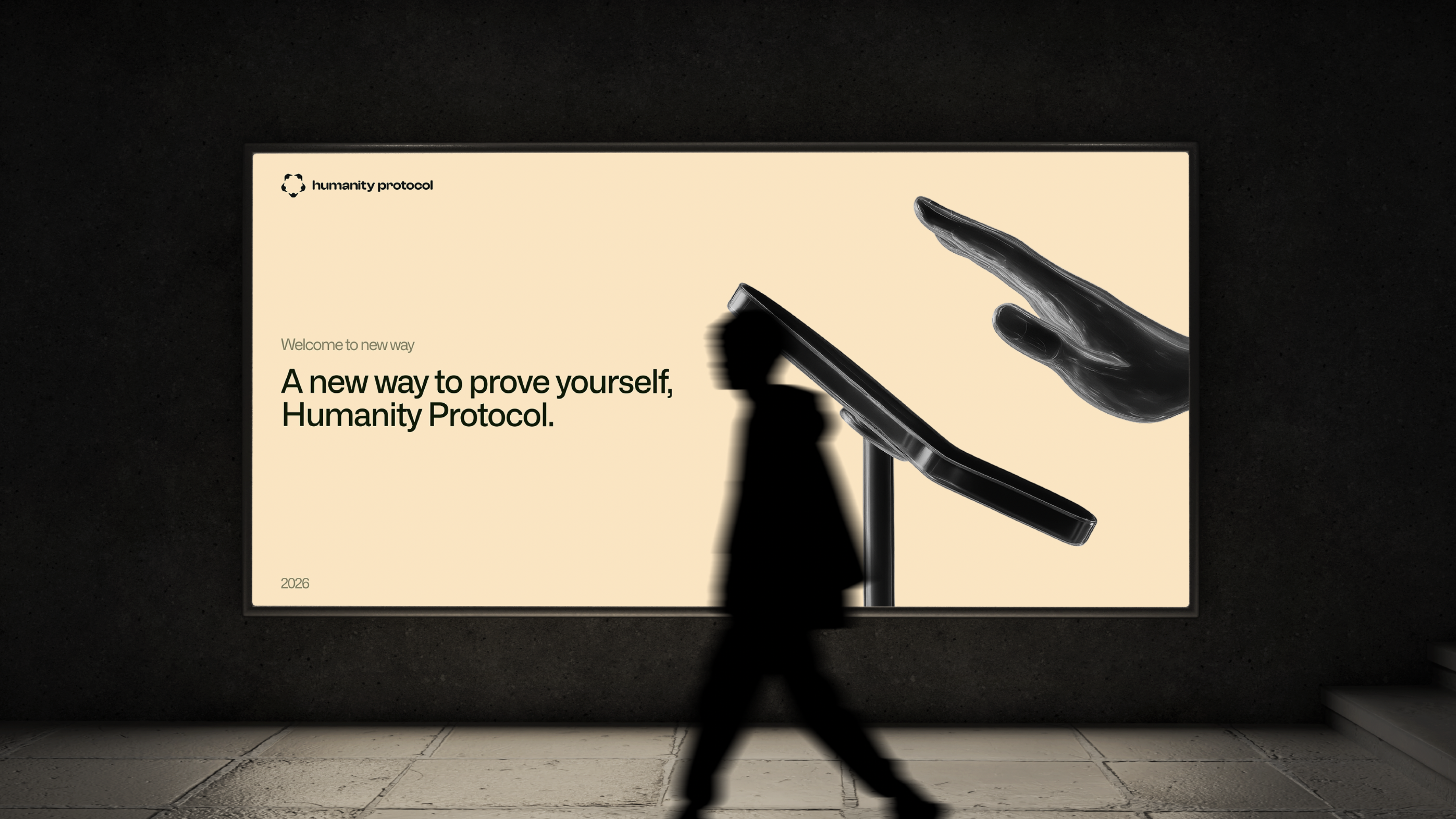
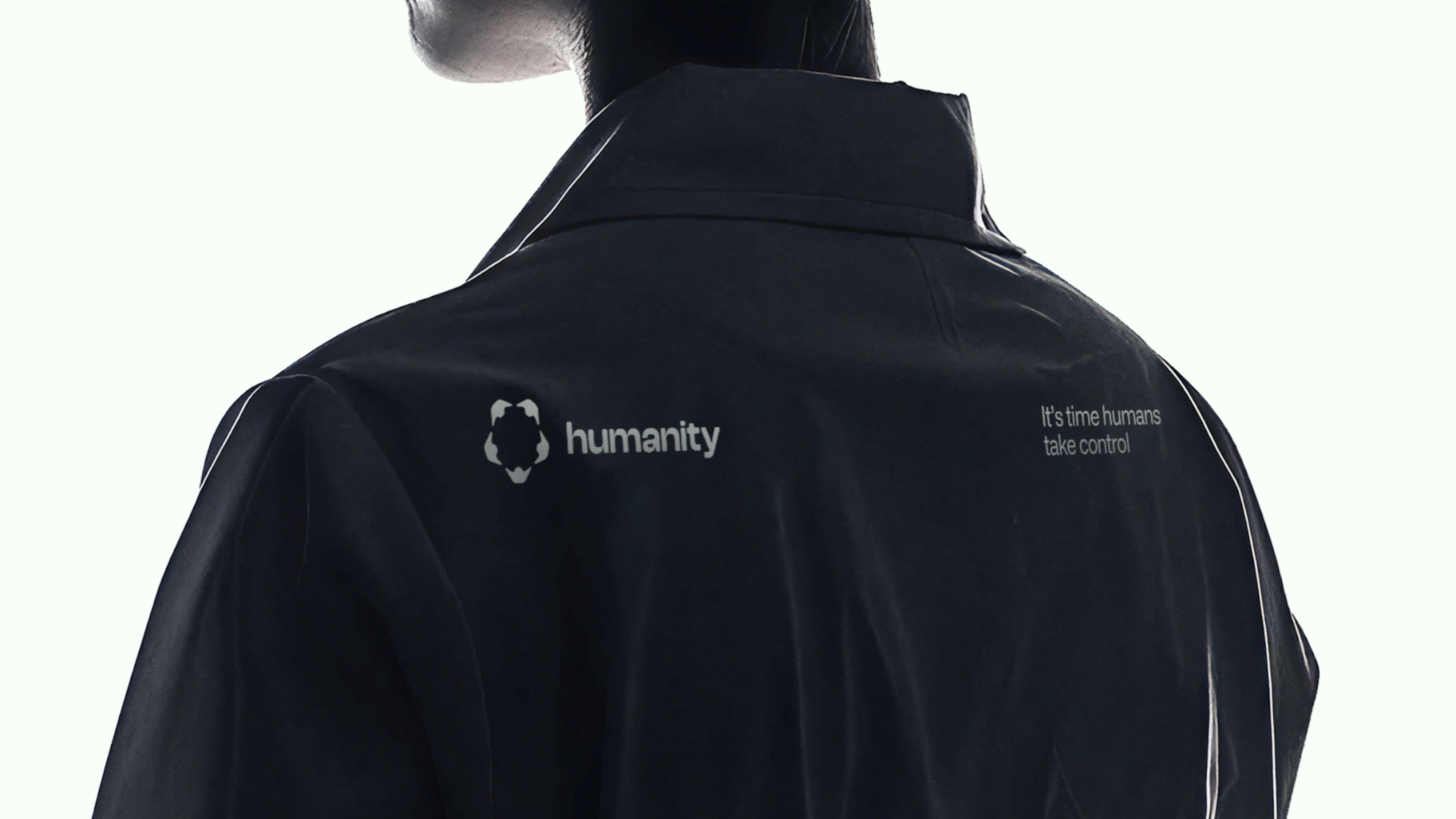
The challenge was to take that fundamentally human idea and make it feel precise, modern, and credible in the blockchain ecosystem — legible as a token symbol, scalable as a brand mark. The solution was to abstract the form until the humanity was implied rather than illustrated. The mark reads as a tech symbol first; the five figures reveal themselves on closer inspection. It earns its warmth rather than broadcasting it.
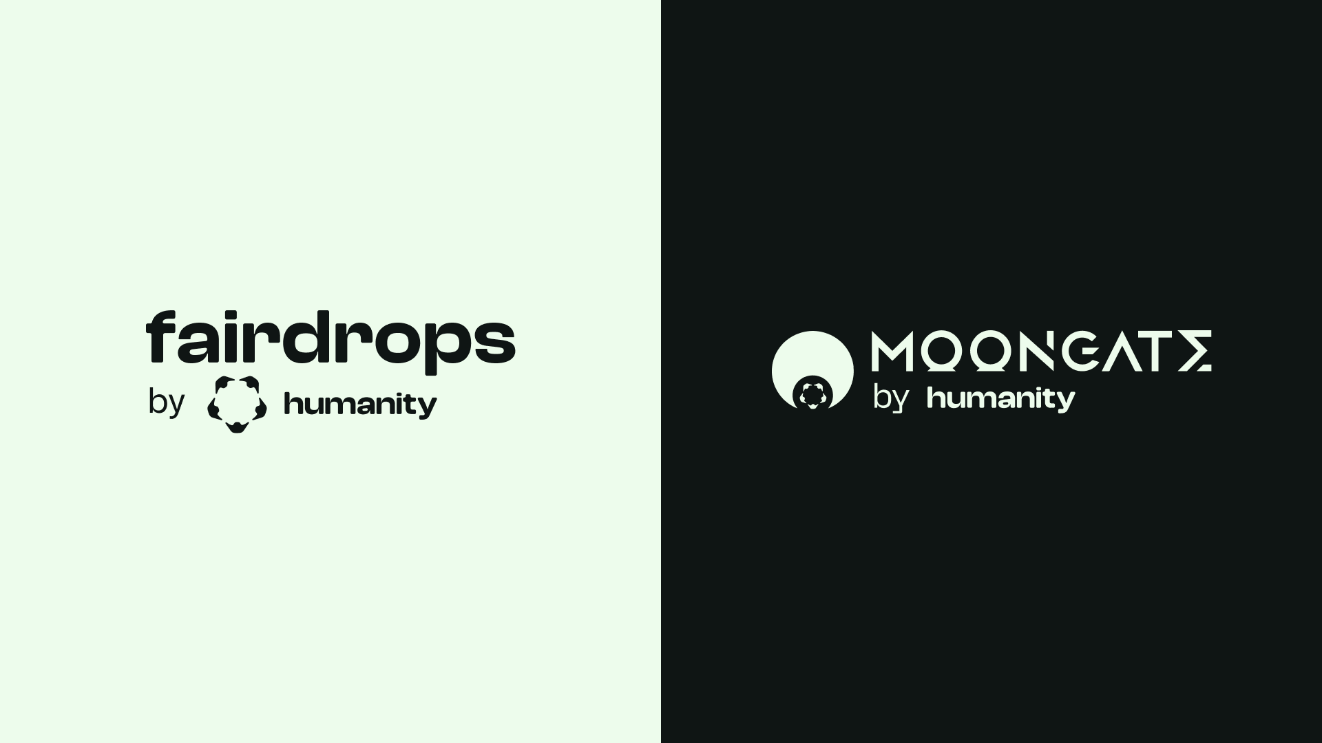
Evolution
Three years is a long time in Web3. As Humanity Protocol raised $30M, expanded its audience from crypto natives to enterprises and institutions, and moved toward its Token Generation Event, the brand had to grow with it — and so did our collaboration.
The core concept — Solarpunk warmth, the human/tech equilibrium — remained the right foundation. What changed was the execution. The earlier visual language, built for an audience of early adopters, had the energy of a brand finding its feet. The matured version pulled back on the rawness and dialled up the refinement: cleaner layouts, more restrained graphic assets, a tighter colour balance. Same soul, sharper expression.
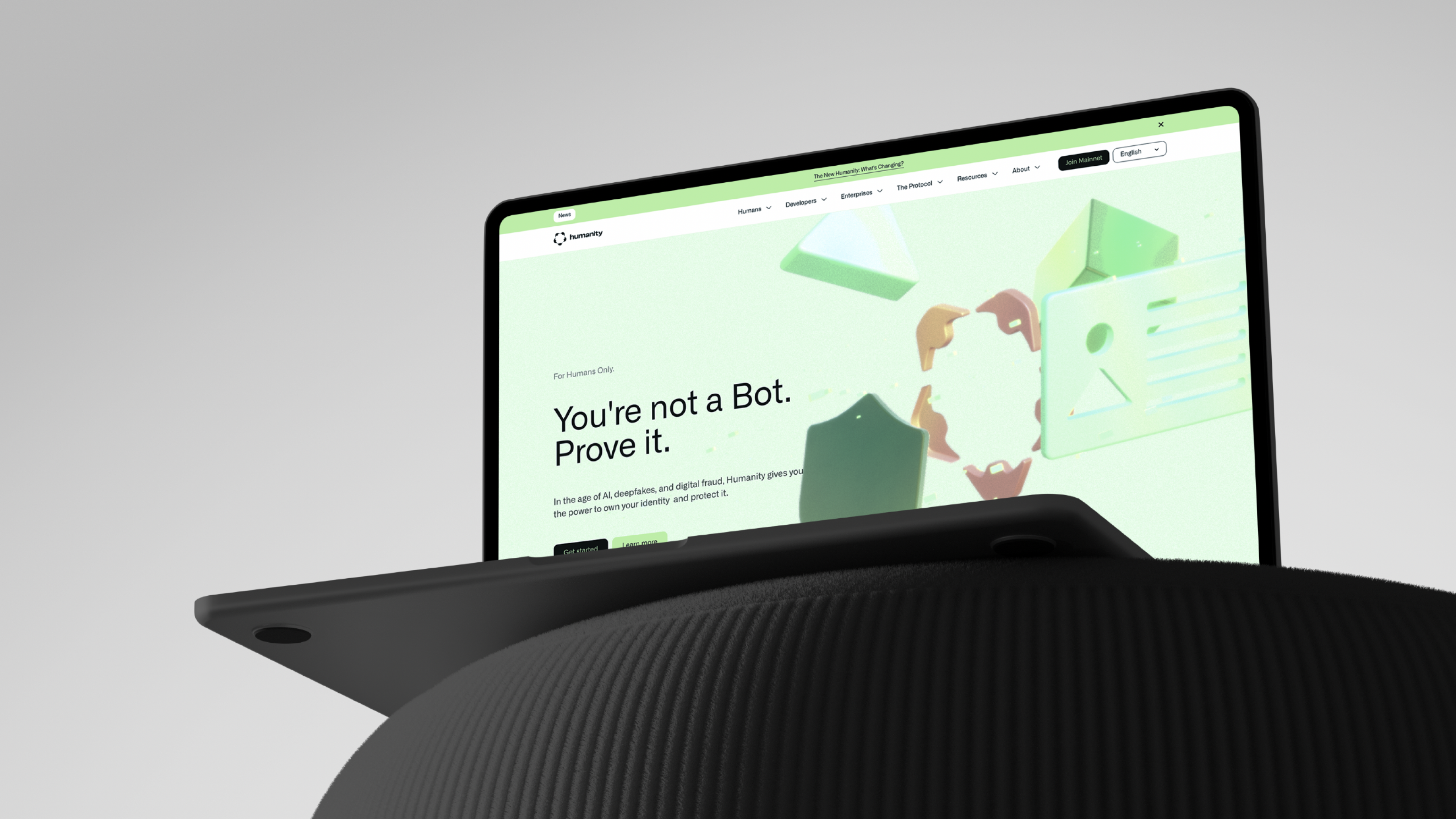
The current site — minimal, confident, institutionally credible — is the natural endpoint of that arc.
Outcome
Over three years of creative partnership, the brand helped Humanity Protocol raise $30 million, grow to over 8 million verified users, and establish itself as a leading player in decentralised identity. It now serves enterprises across hospitality, travel, and personal finance — a long way from its Web3-native origins.
The identity held through every stage of that growth. That, for us, is the measure of a concept that was right from the start.
“I worked with Sberla for the first time four years ago, and since then they've been my go-to creative team! Besides being one of the best design teams I've ever met, they also know how to adapt the creative strategy to business goals like no one else!”
Joao Machado
Ex-CMO at Humanity Protocol
Related projects
Warden Protocol
We gave Warden a proper brand slap. They took it all the way to $200 million.
Everything
Everything needed a slap. We were happy to help.
BasedAi
BasedAI needed a brand as serious as their ambitions. We built it.
Nerwo
We built the home for Web3 freelancers. From the name up.
Slophy
Slophy didn't need a brand. It needed a universe. We built both.