
Slophy
We didn't just design Slophy. We invented the world it lives in.
Service
Brand identity, Website, Coin design, Logo, App, Product design, Pitch deck design, NFTs, Illustration, Naming, Storytelling
Industry
Digital detox, Web3
Stage at the time of consulting
Early stage
People that worked on it
- Luca Gabino — Art Director, Graphic Designer & Illustrator
- Elena Colautti — Illustrator
- Ivan Rossi — Business Development & Strategic Marketing
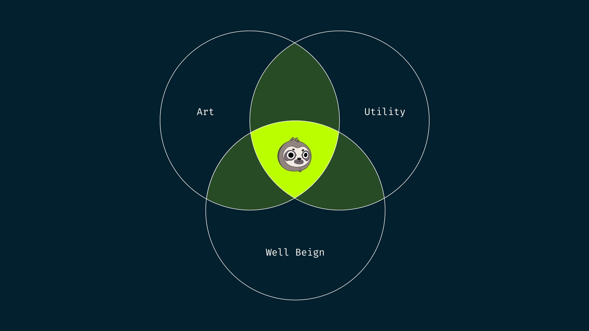
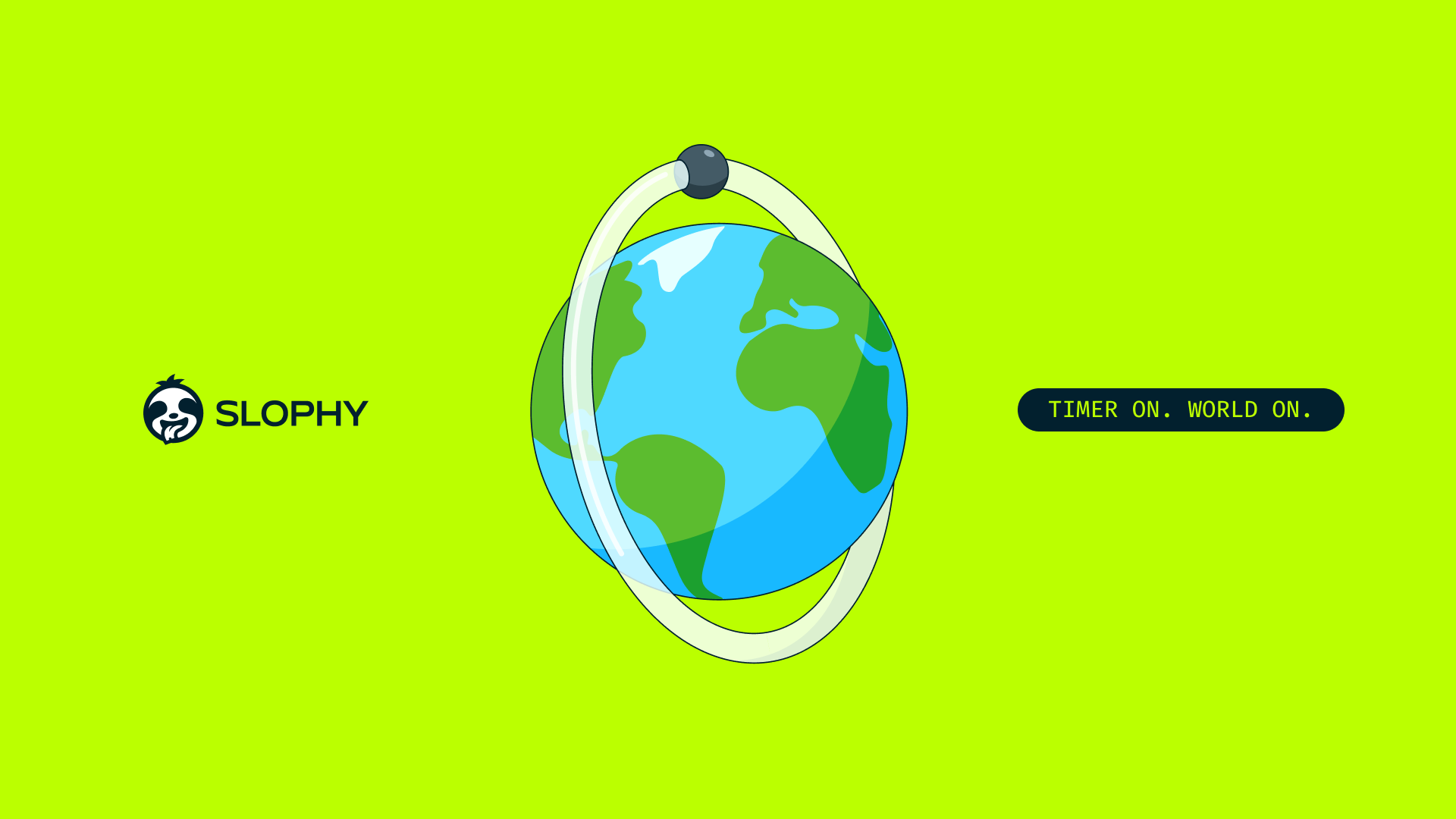
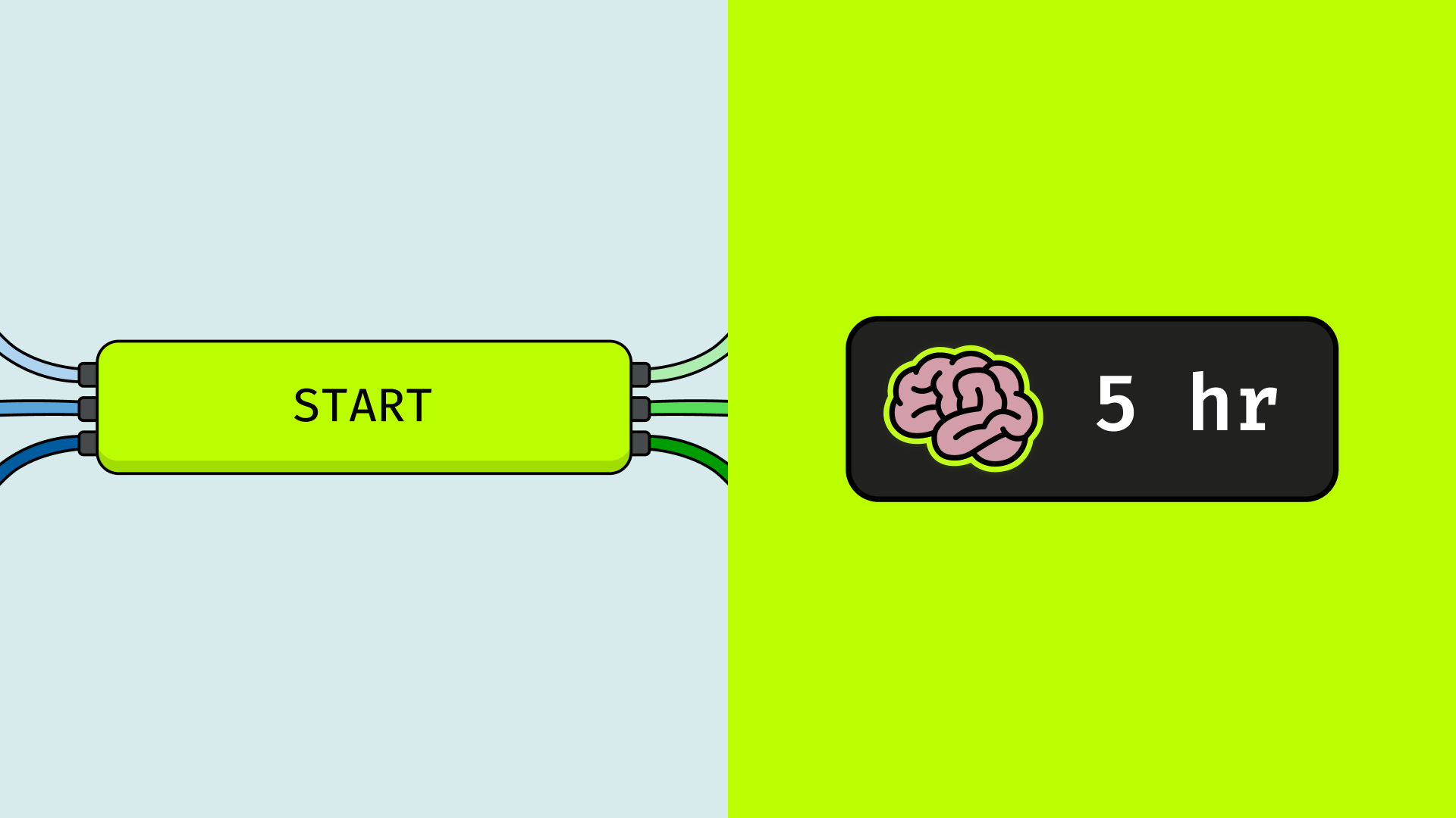
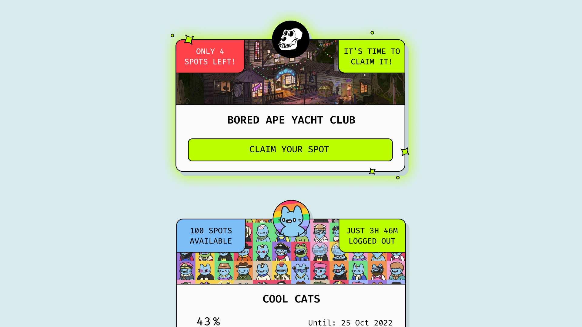
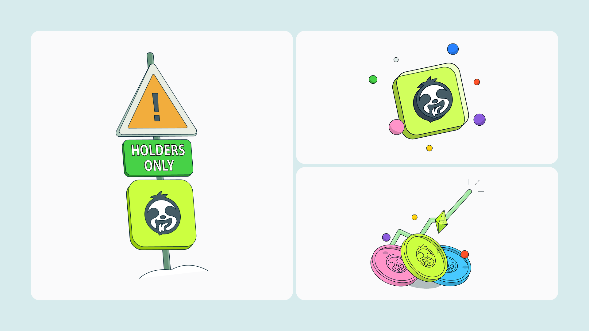
Slophy is a D2E (Disconnect to Earn) platform, the first of its kind. The concept is simple and radical at the same time: the more you disconnect from your smartphone, the more time you accumulate, and that time becomes the currency to unlock real rewards. Not tokens. Whitelist spots for the most promising crypto projects, curated and delivered while you were offline. The idea behind it is almost paradoxical: in a world where missing five minutes of crypto X/Twitter can feel like missing everything, Slophy proved that stepping away didn't mean falling behind. It meant someone was watching the market for you.
The Brief
There was no brief. There was an idea, a problem worth solving, and a blank page. The challenge was to build something from nothing — not just a product, but an entire world around it. A world that could make a serious conversation about smartphone addiction feel fun, collectible, and genuinely worth joining.
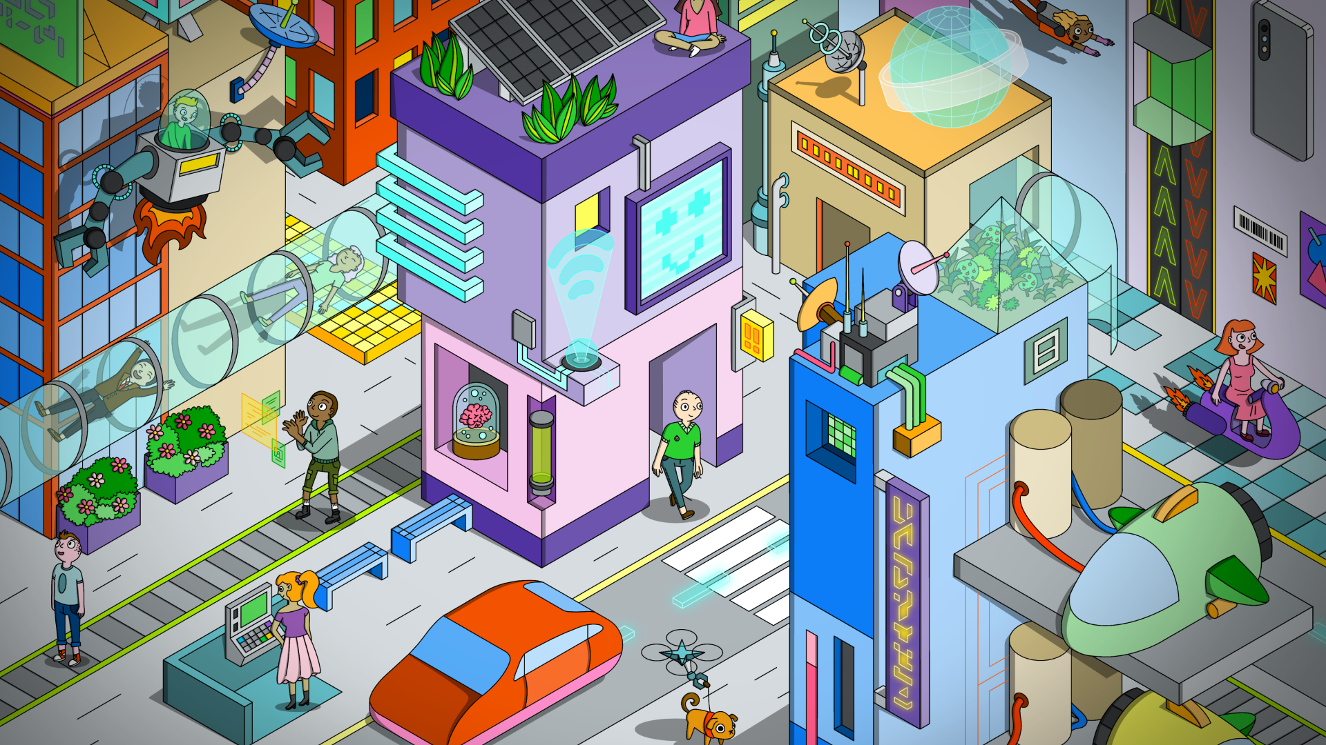
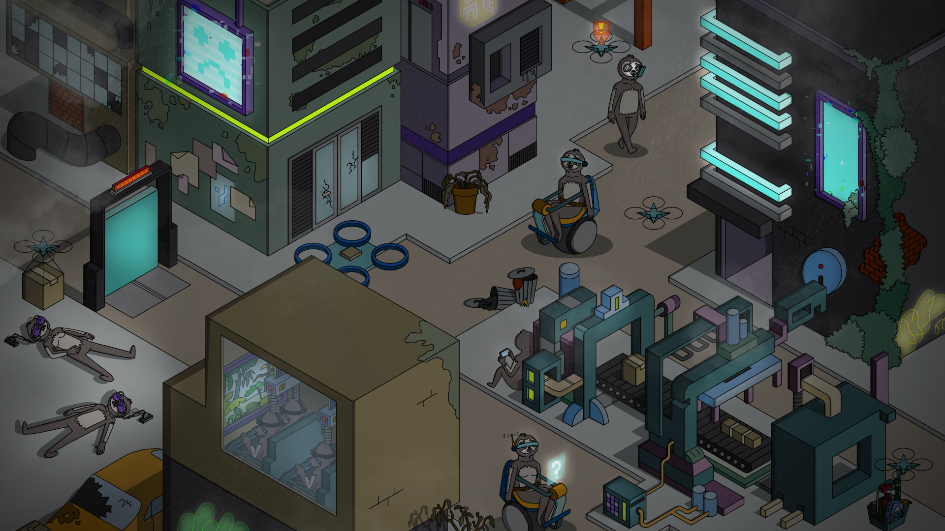
The creative direction came from a single question: what if we turned the problem into the character? Humans glued to their screens, slowly becoming slower, lazier, more sedentary — more sloth-like. The metaphor was too good to ignore.
The Thinking
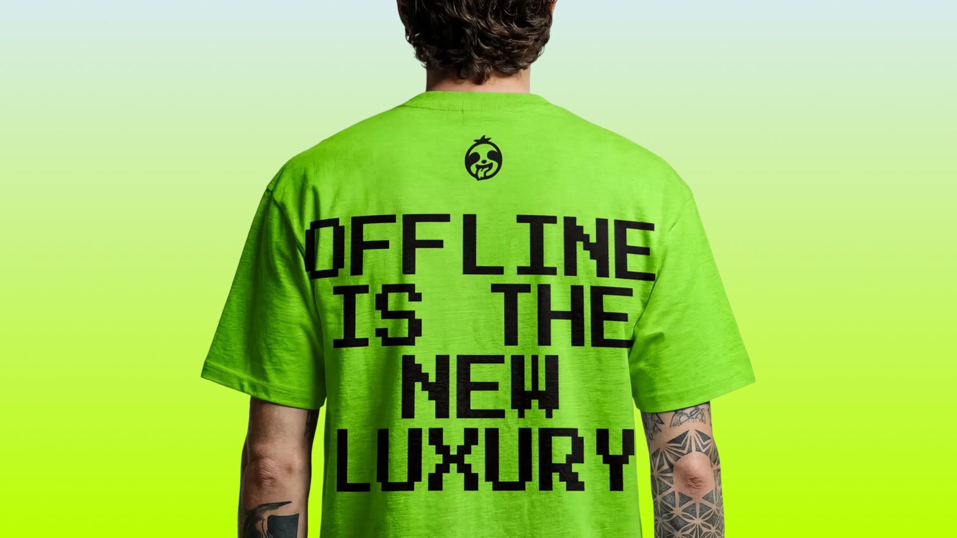
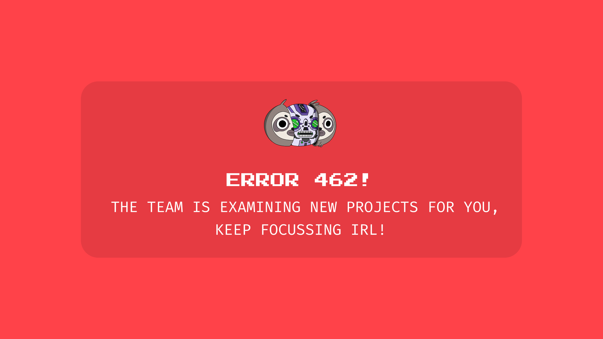
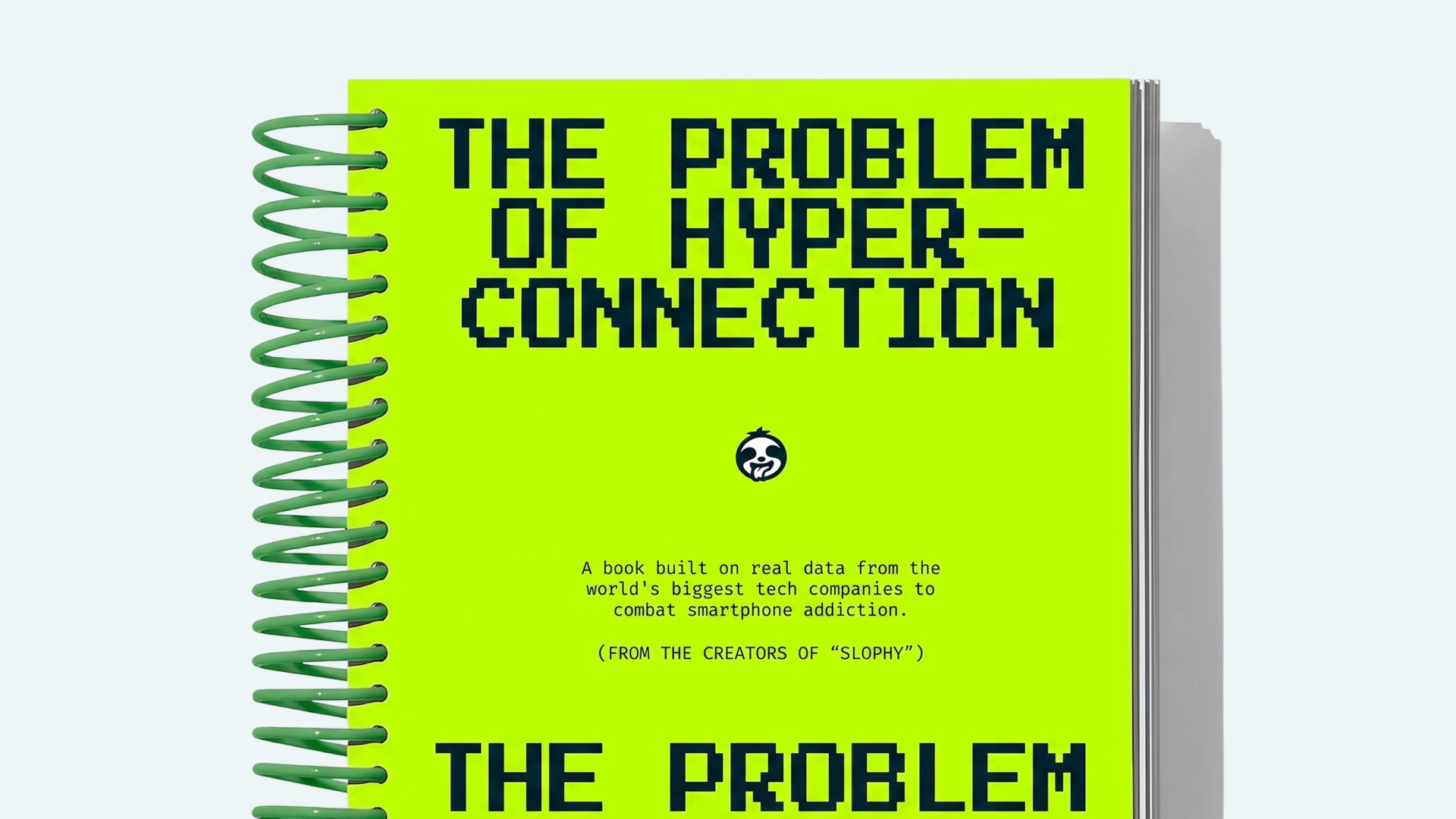
The logo is a sloth face — round, expressive, immediately recognisable. On a background of electric acid green, it hits like a signal flare. The colour choice was deliberate and counterintuitive: this is a product about slowing down, but the identity screams energy. The tension is the point. Slophy doesn't lecture you about your screen time — it makes you want to put the phone down just to see what happens next.
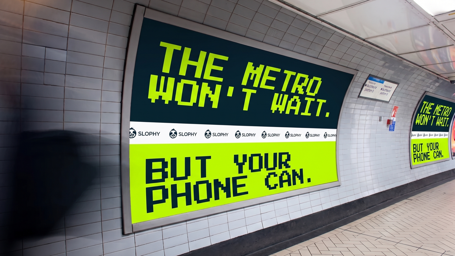
The wordmark sits in all-caps beside the mark, bold and grounded, keeping the identity legible and scalable across every context from app icon to OOH advertising.
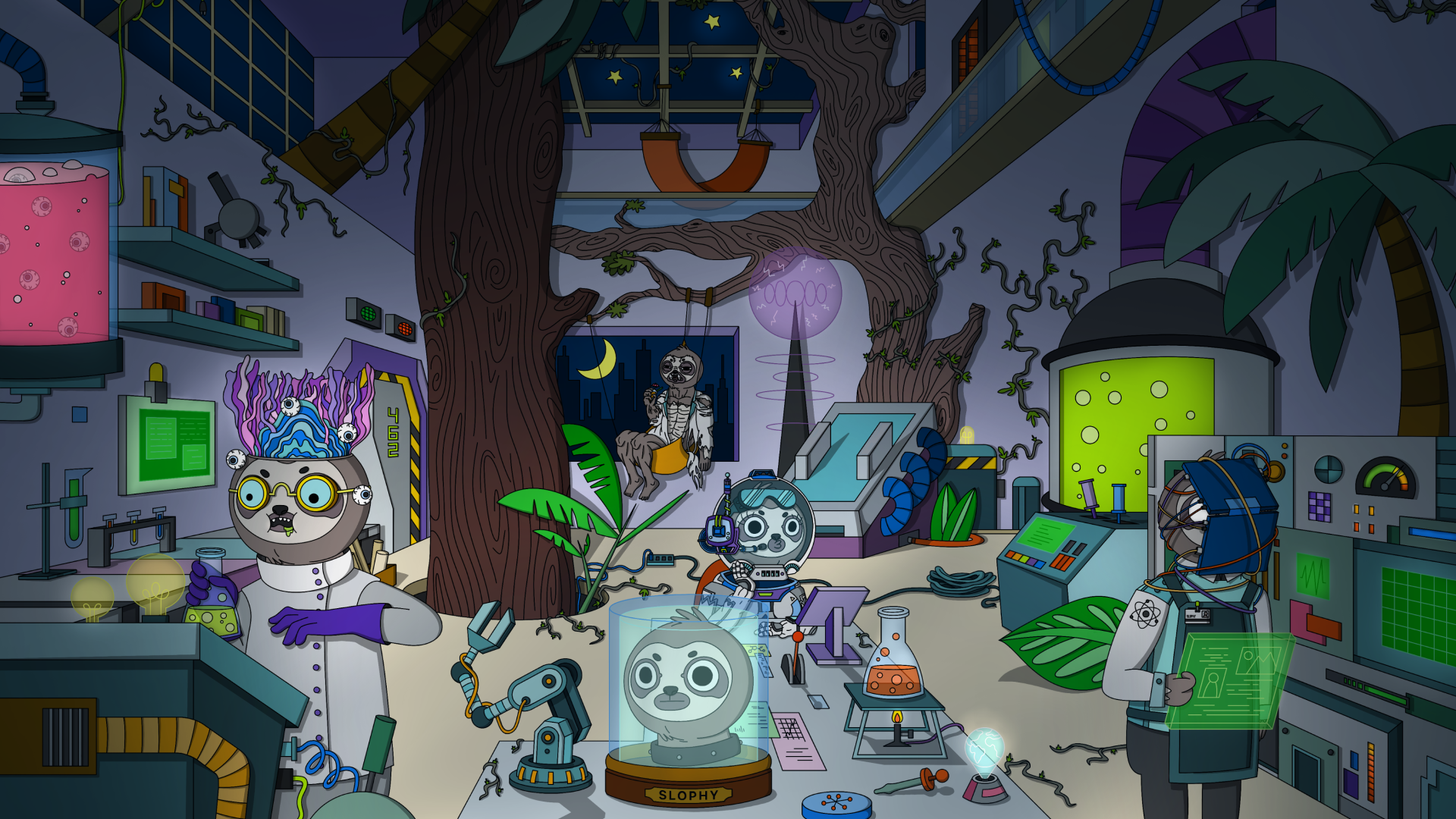
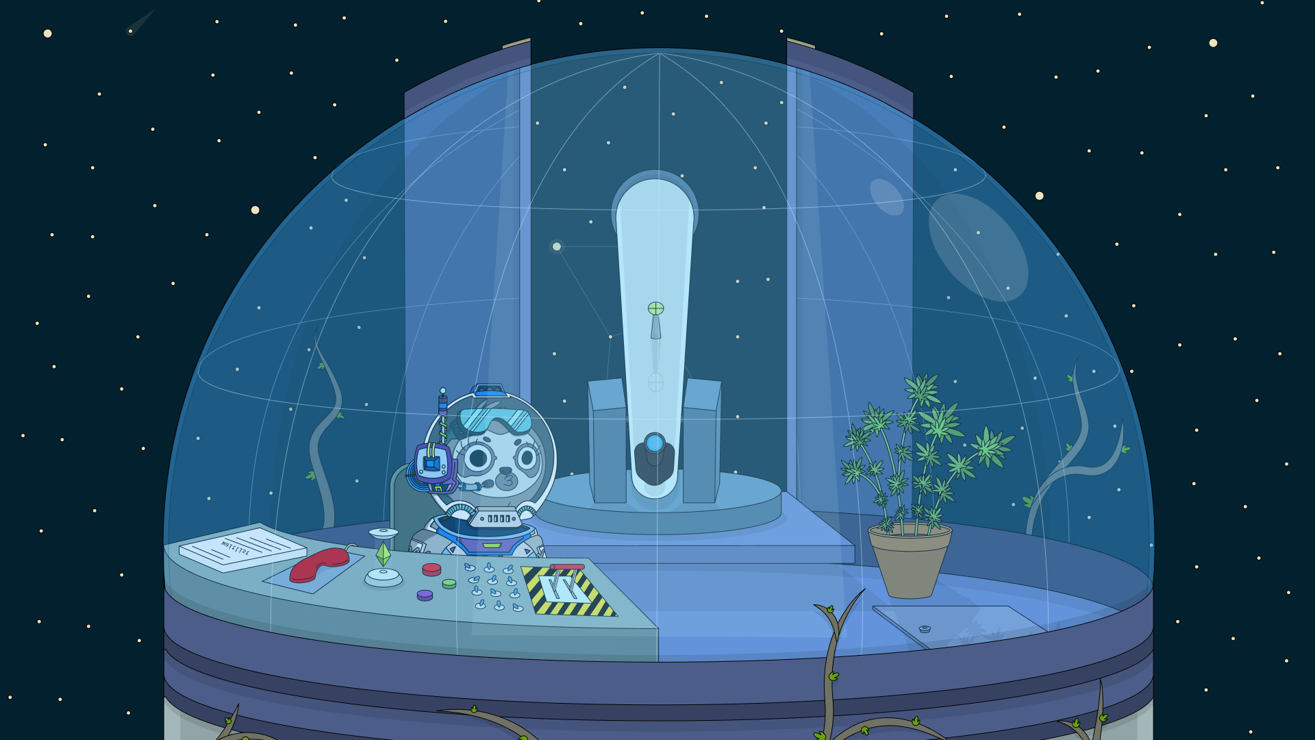
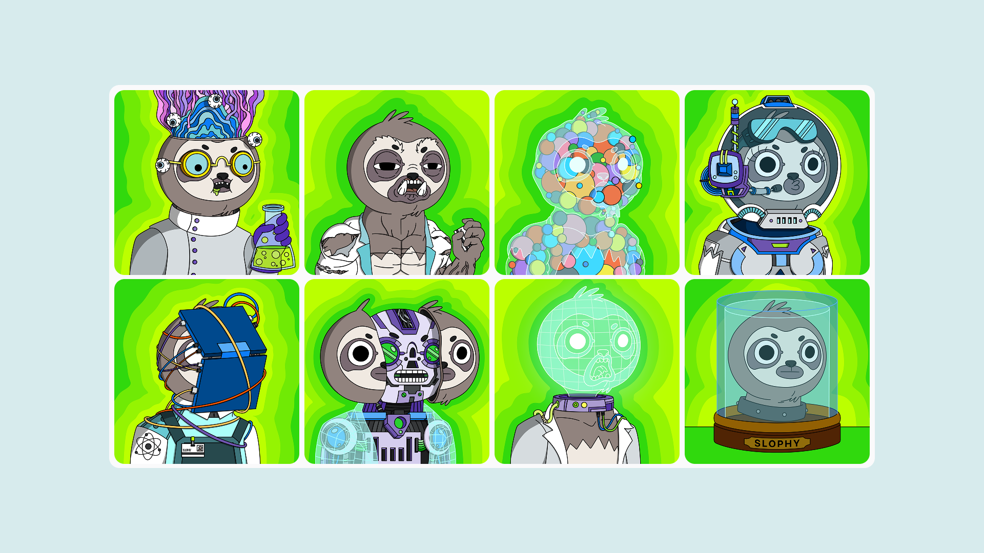
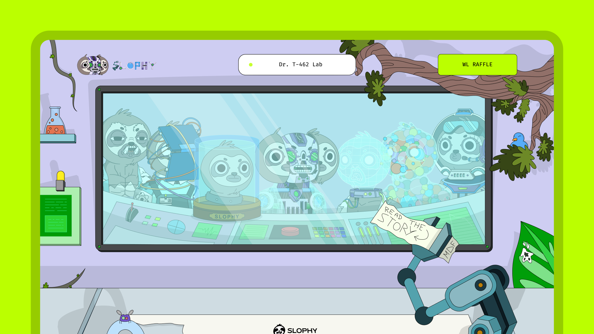
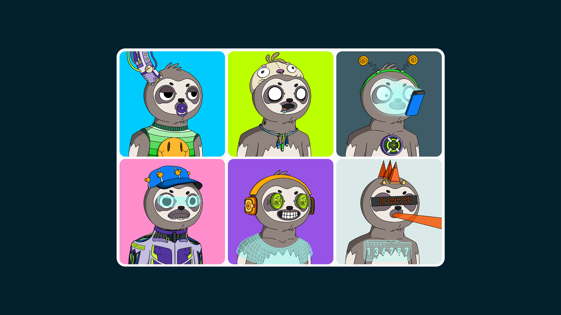
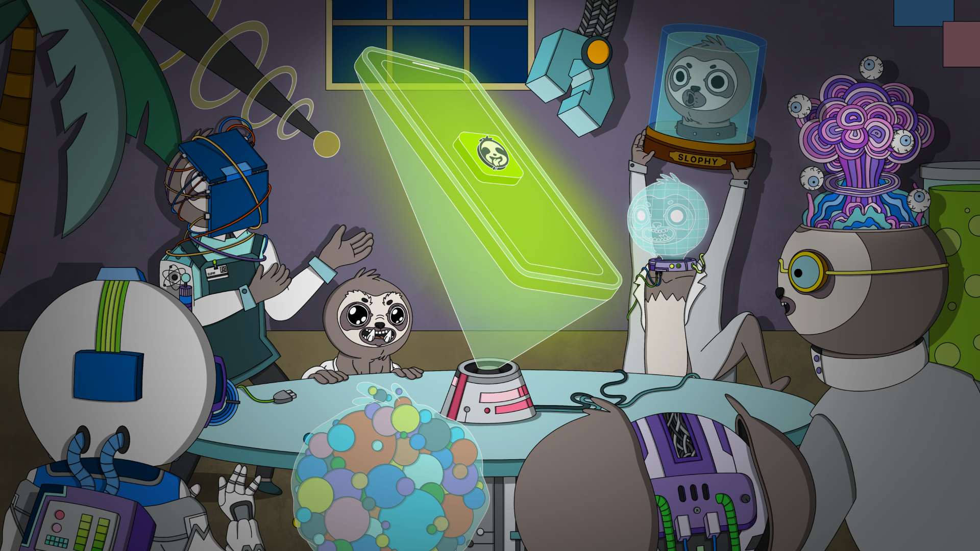
But the real creative work lives in the narrative universe built around the platform. Slophy has a story — a full, illustrated, absurdist world set in a not-too-distant future where hyper-connected humans have slowly evolved into sloths. Eight mad scientists — Dr. Rick Nixxon (a disembodied head in a jar), Dr. T-462 (a self-made cyborg), Dr. Legstrong (permanently sealed in a spacesuit), and five equally unhinged colleagues — gather in a secret underground lab in New Pork to solve the crisis. Their solution: an app that rewards disconnection.
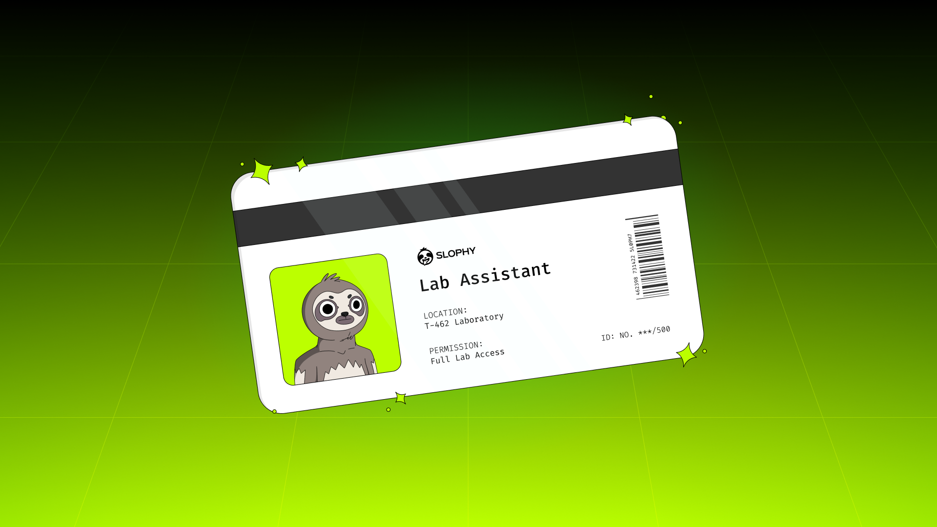
This story isn't a marketing gimmick. It's the structural backbone of everything — the NFT collection, the website, the visual language of the app. The scientists become the NFT characters: hand-illustrated sloths in various states of absurd modification, each one a PFP with personality and lore behind it. The illustration style is somewhere between Saturday morning cartoons and indie comic — detailed, layered, warm, and completely its own thing.
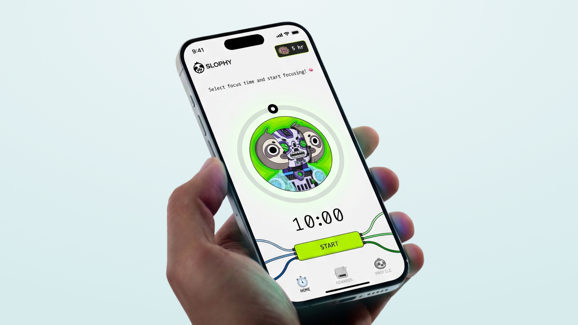
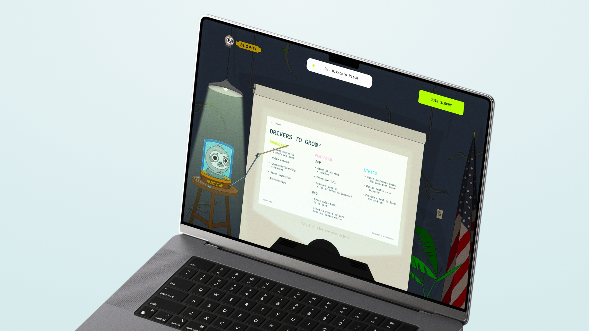
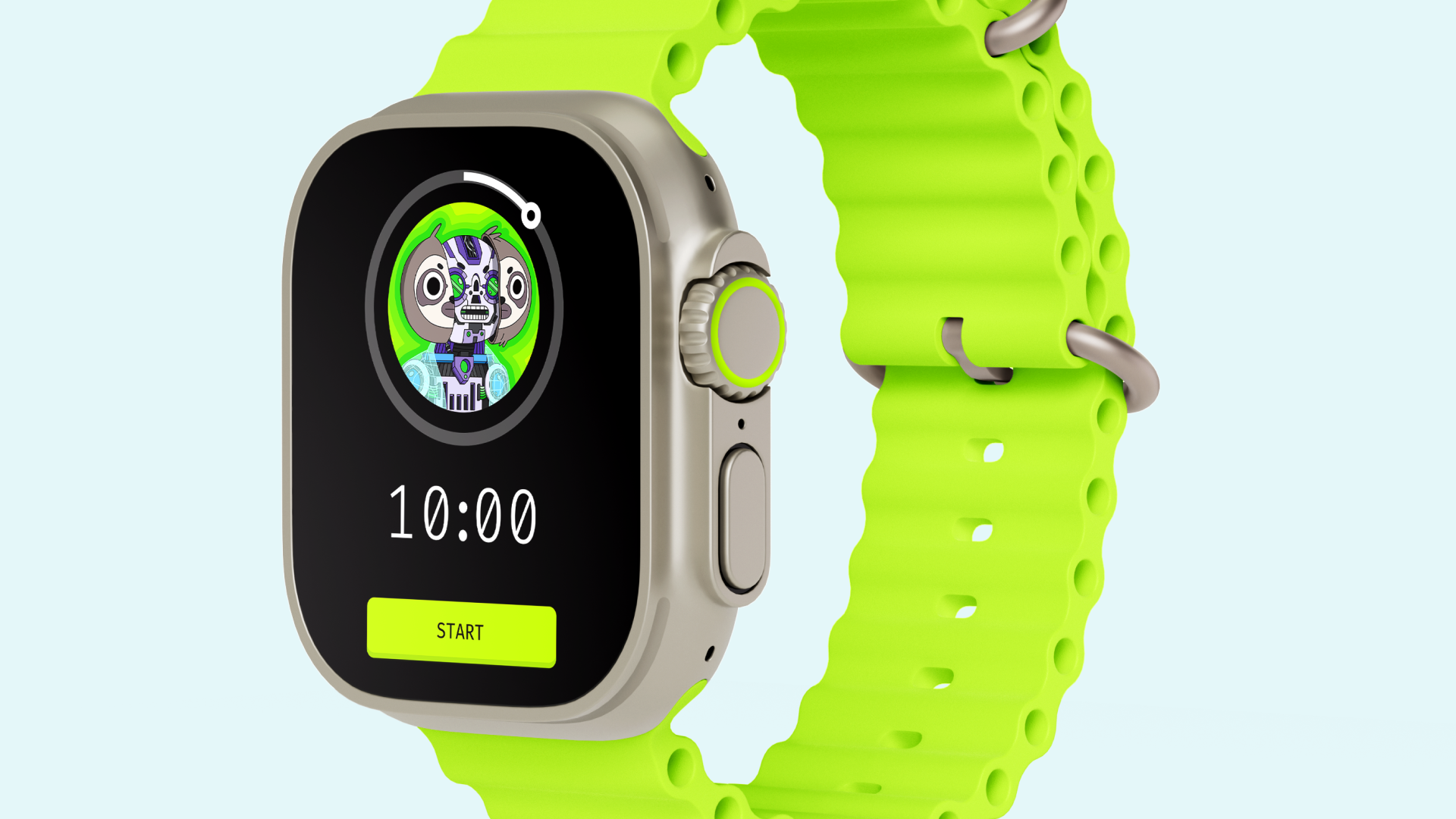
The website itself is fully illustrated — an immersive environment built around the lab and its characters, where the product pitch and the story are inseparable. The app UI follows the same logic: simple, three-section structure with the disconnection timer at its core, wrapped in a visual language that makes putting your phone down feel like an event rather than a chore.
What We Delivered
Brand naming, full visual identity including logo and mark, colour system, typography, the complete narrative universe and creative concept, character design, a fully illustrated website, app design, and the NFT collection — built entirely from scratch.
Outcome
Slophy is a proof of concept for what brand-led product building looks like when there are no constraints and no compromises. Every element — from the mad scientist lore to the acid green palette to the sloth NFTs — serves the same idea: that disconnecting can be fun, rewarding, and worth doing. The world is coherent, the product is real, and the identity holds everything together without a single borrowed idea.
A brand about slowing down, built to make you stop and look twice.
Related projects
Humanity Protocol
We guided Humanity from an early-stage startup to a fully funded, mature unicorn company
Warden Protocol
We gave Warden a proper brand slap. They took it all the way to $200 million.
Everything
Everything needed a slap. We were happy to help.
BasedAi
BasedAI needed a brand as serious as their ambitions. We built it.
Nerwo
We built the home for Web3 freelancers. From the name up.

