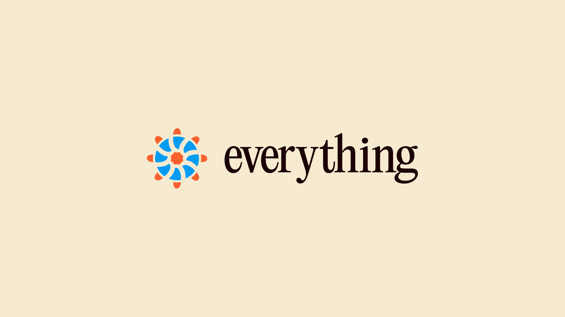
Everything
Built for the trenches. Credible in the boardroom.
Service
Visual identity, Website, Coin Design, Video, Art Direction
Industry
DeFi, Telegram Trading, Web3
Stage at the time of consulting
From early stage to growth
+21k
increase in followers since we started
Brand awareness
People that worked on it
- Raffaello Cuccuini — Art Director & Graphic Designer
- Luca Gabino — Graphic Designer & UI/UX Designer
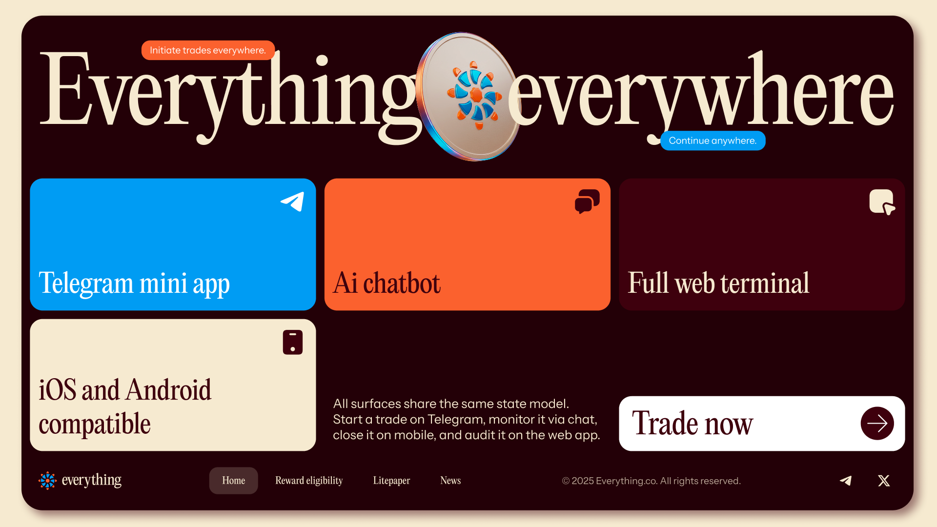
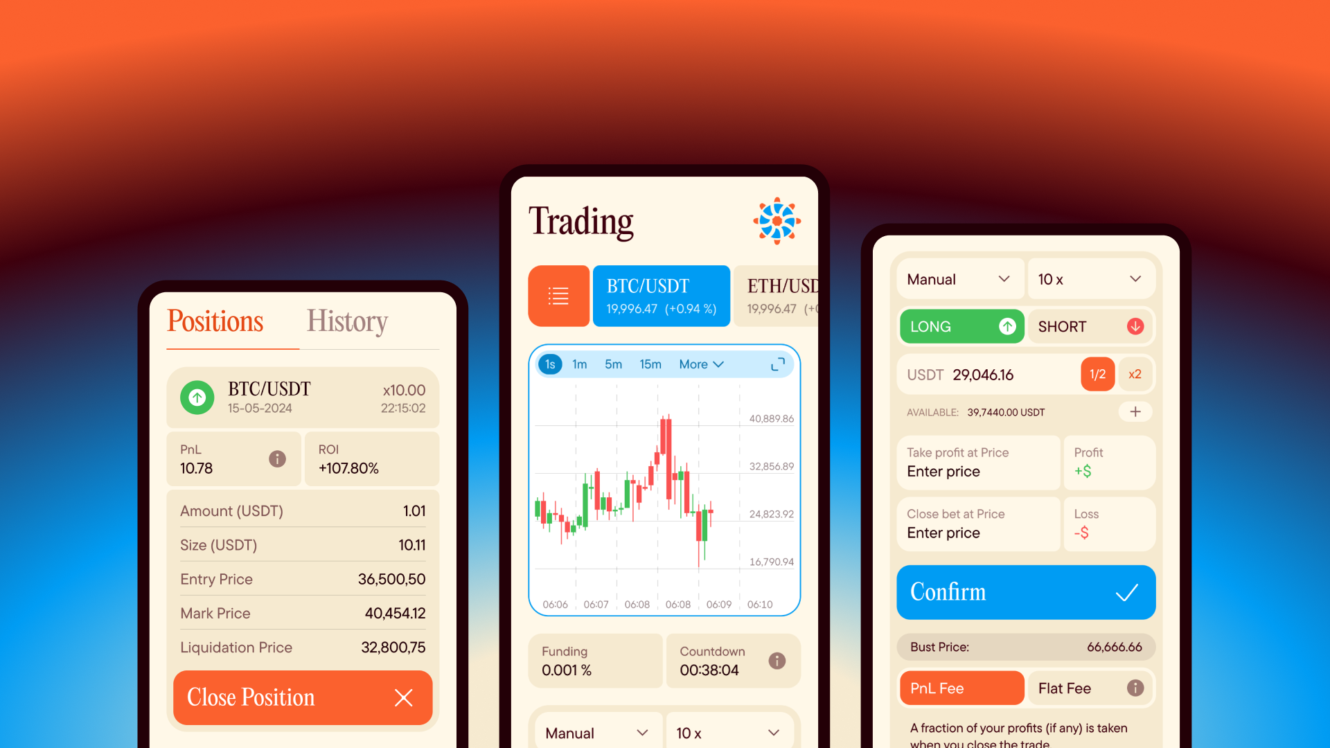
Everything.co is a no-KYC trading platform built on Telegram, offering a wide range of trading pairs with the speed and freedom that the crypto-native crowd actually wants. Born for degens, built for the future — and now processing over $3 million in daily trading volume, with a token launch on the horizon.
SBERLA has been the creative partner behind the brand from day one, shaping an identity that could hold its own in two very different rooms at once.
The Brief
The challenge was a genuine contradiction: design a brand that feels at home in the degen trenches and credible in institutional boardrooms — at the same time, without compromise. Too polished and you lose the community. Too chaotic and you lose the capital.
Most brands in this space pick a side. We didn't.
The Thinking
The core idea was rooted in internet culture — not as a gimmick, but as a genuine design language. The crypto audience doesn't just consume memes; they communicate through them, build identity around them, and use them as a trust signal. A brand that speaks that language fluently earns a different kind of credibility than one that merely gestures at it.
The counter-move was to wrap all of that in a visual framework that felt genuinely elegant. Not ironic elegance. Real elegance.
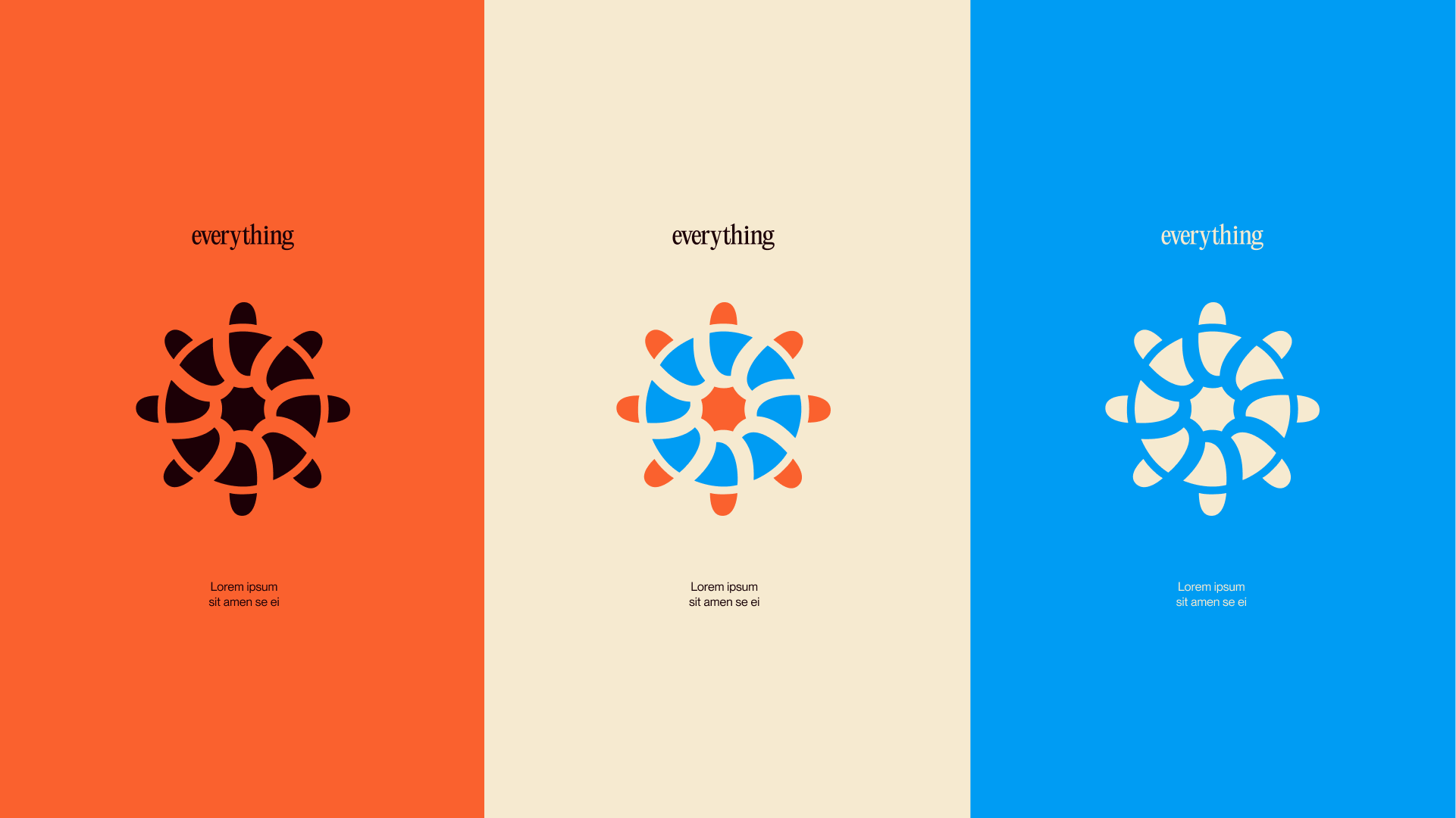
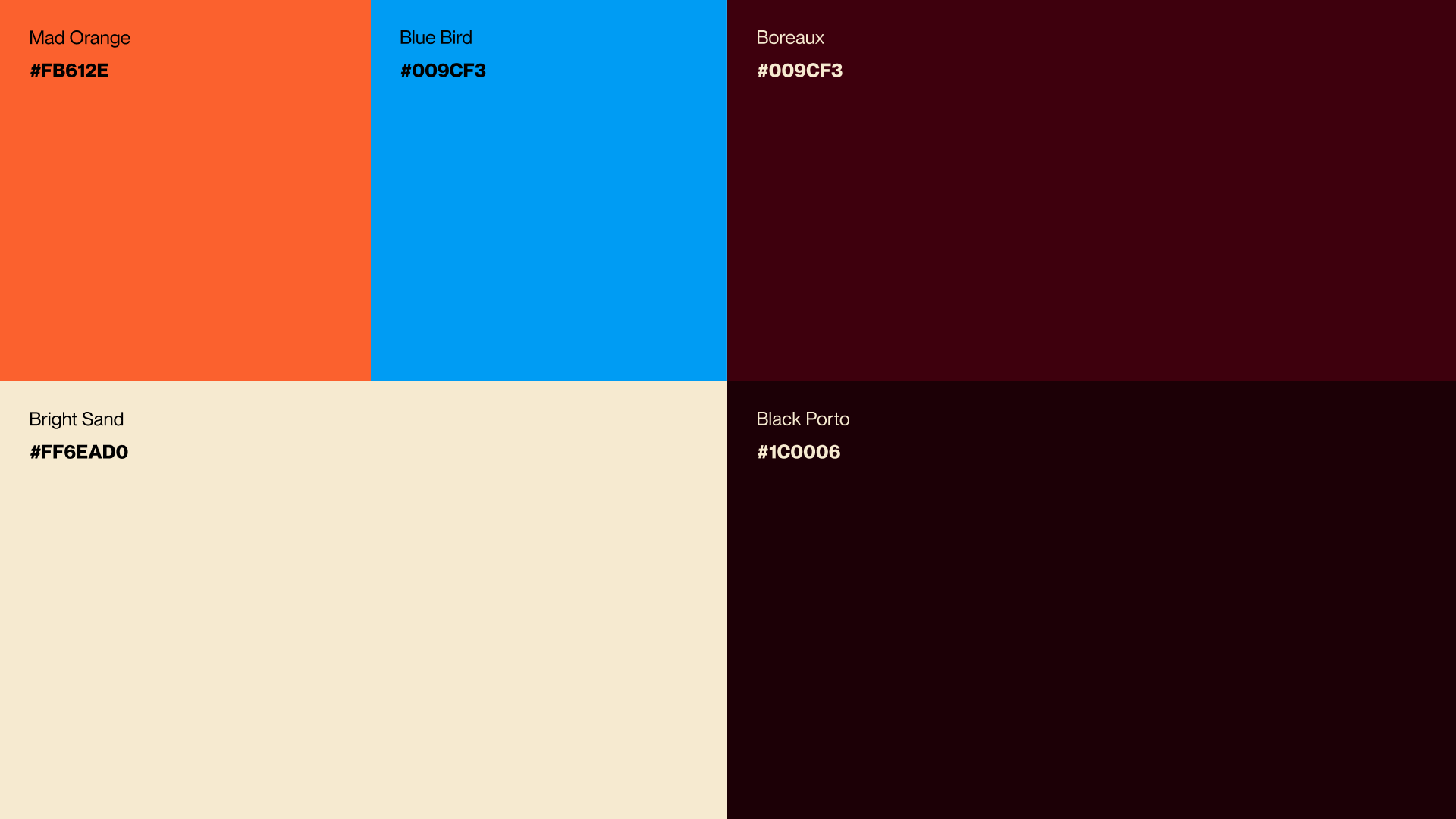
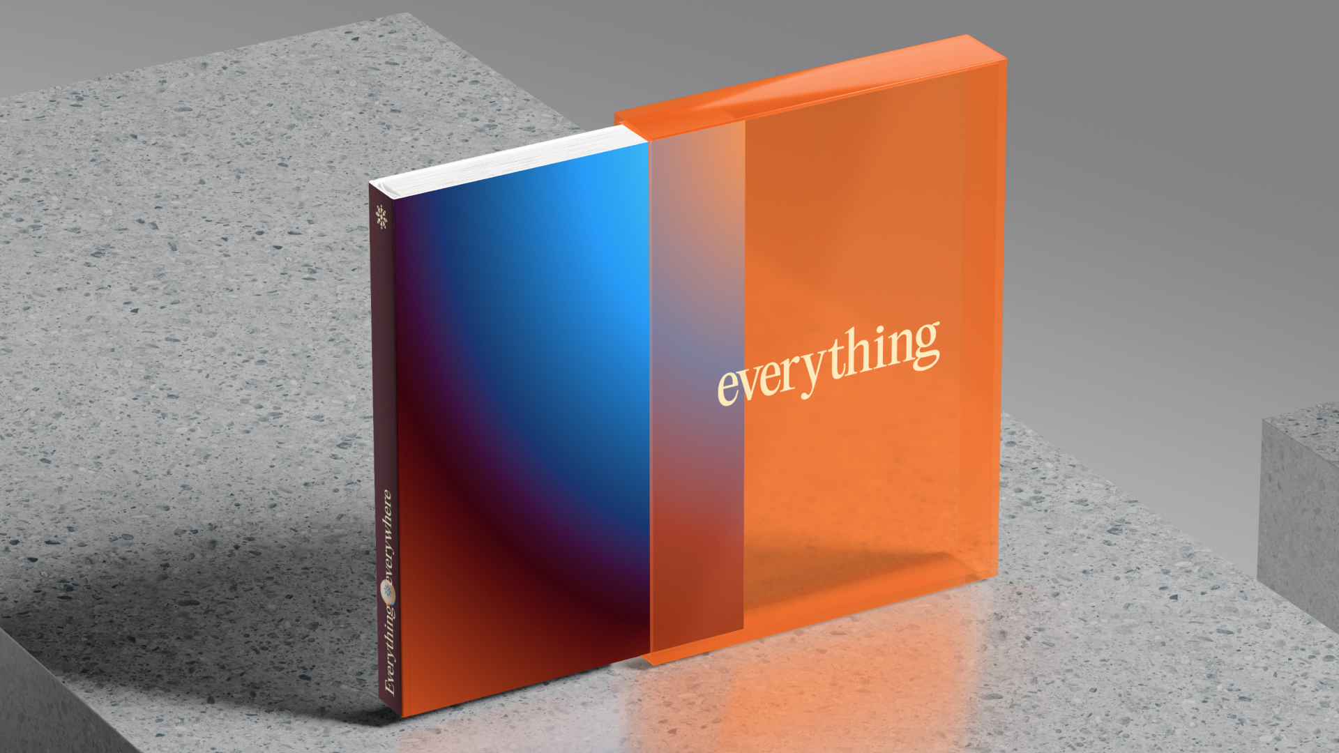
The colour palette holds that tension perfectly: warm sand and deep bordeaux give the brand an almost antiquarian gravity — the kind of palette you'd find in a well-curated gallery or a private members club — while electric orange and RGB blue crash the party with unapologetic energy. Neither side undermines the other. That's the point.
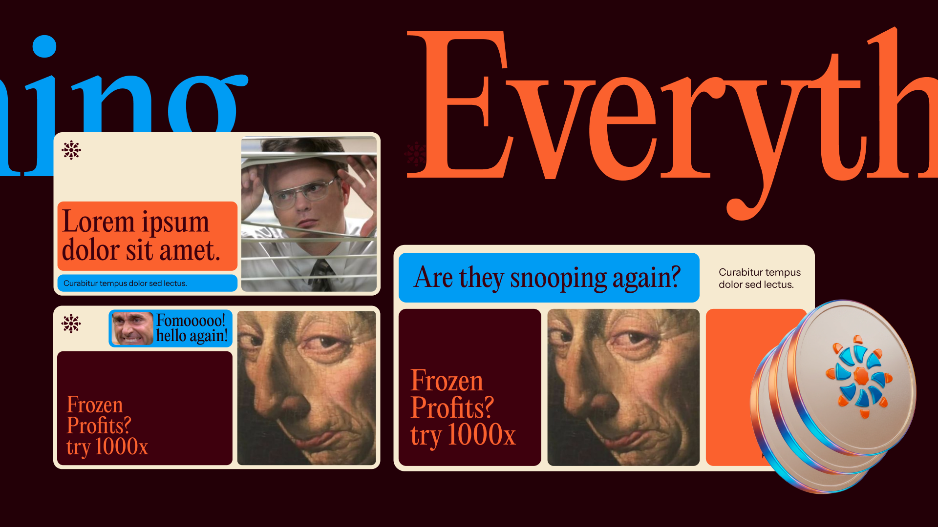
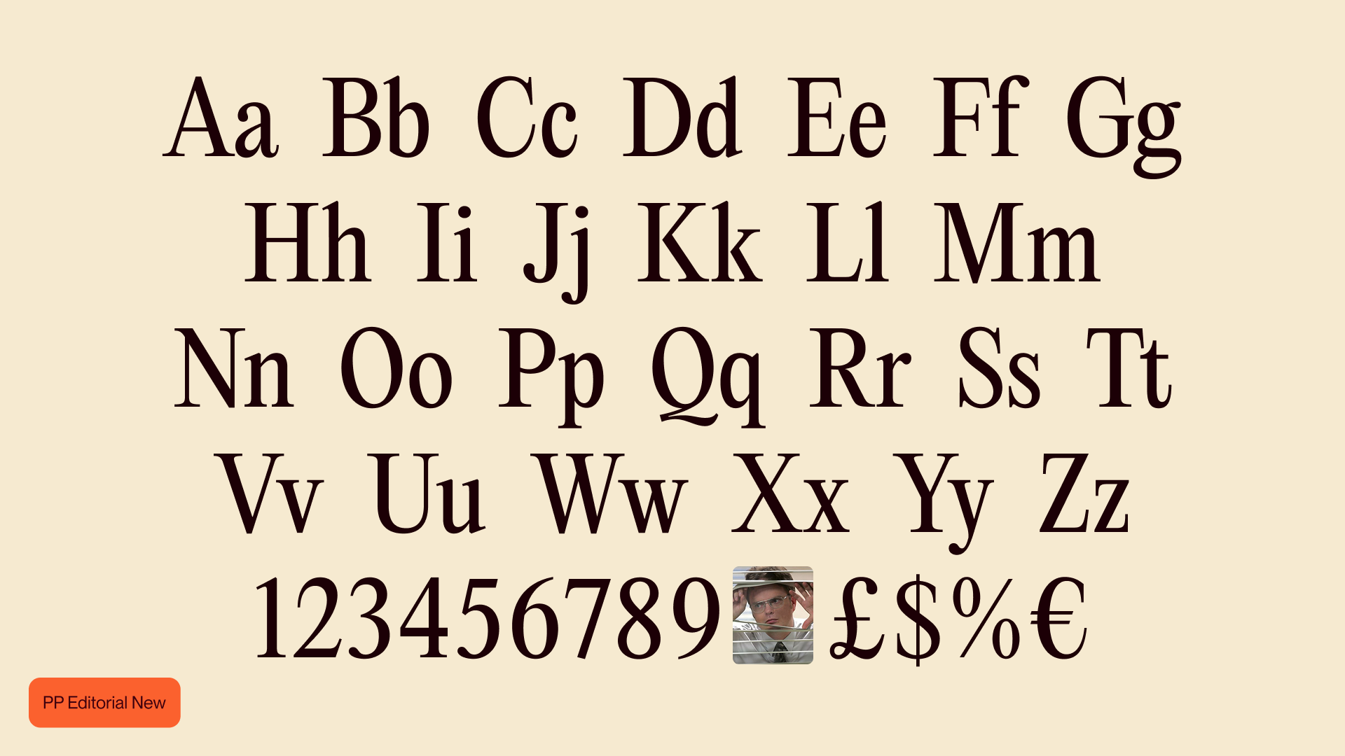
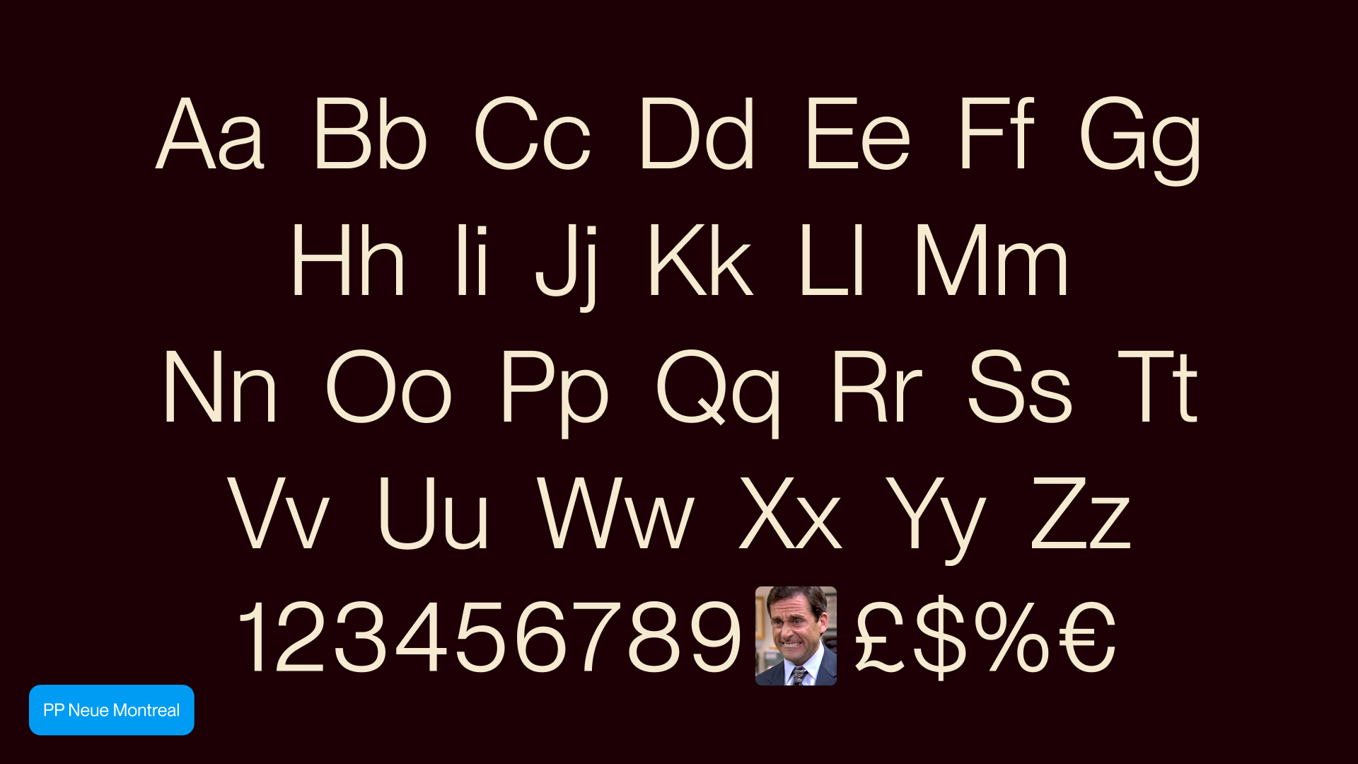
Typography works the same way. PP Editorial New — a high-contrast, condensed serif — brings the weight of a financial broadsheet. Instrument Sans keeps the UI grounded and legible. Together they create a voice that can say "Frozen Profits? Try 1000x" and make it feel both completely unhinged and somehow authoritative.
The Visual Language
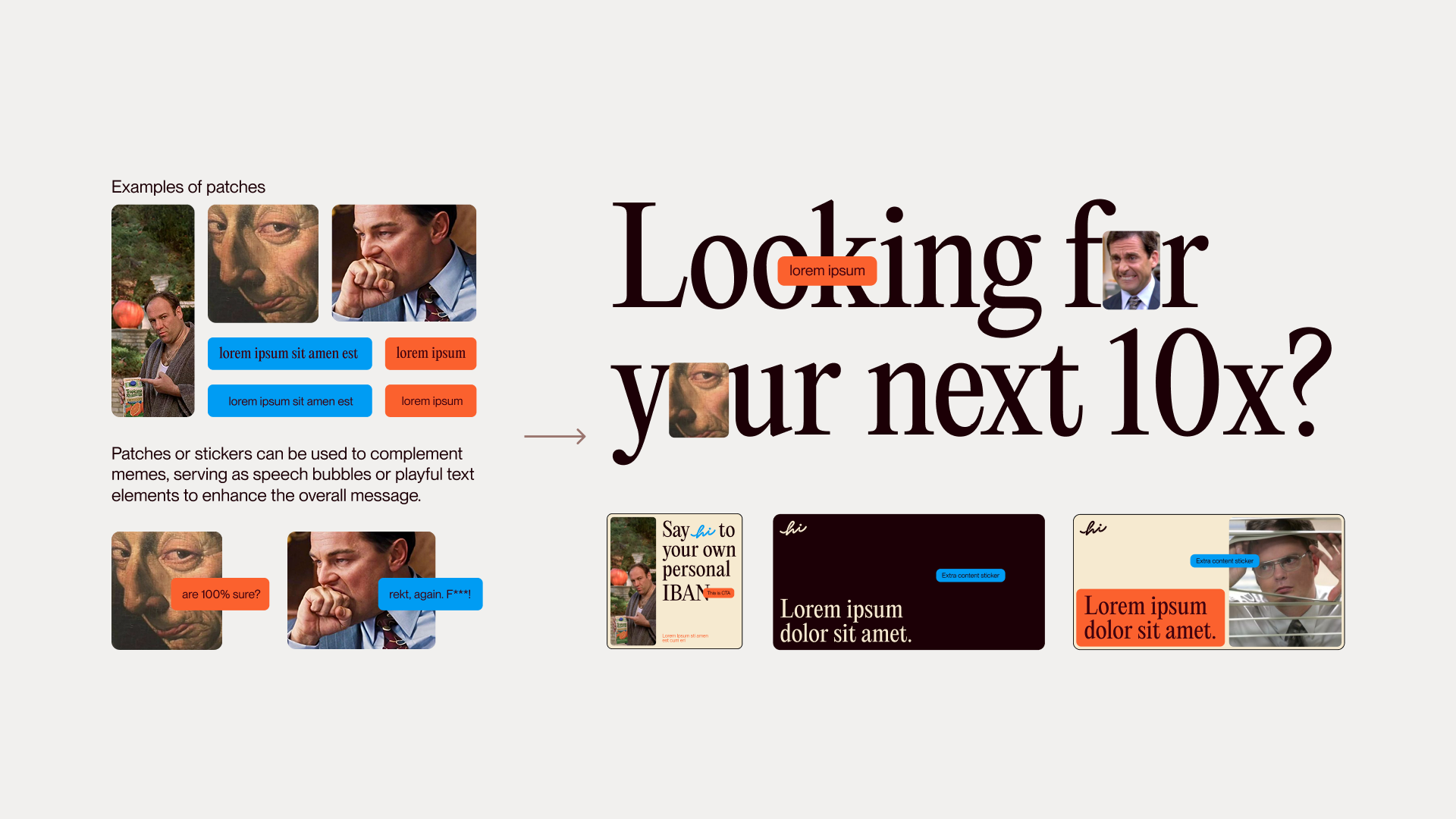
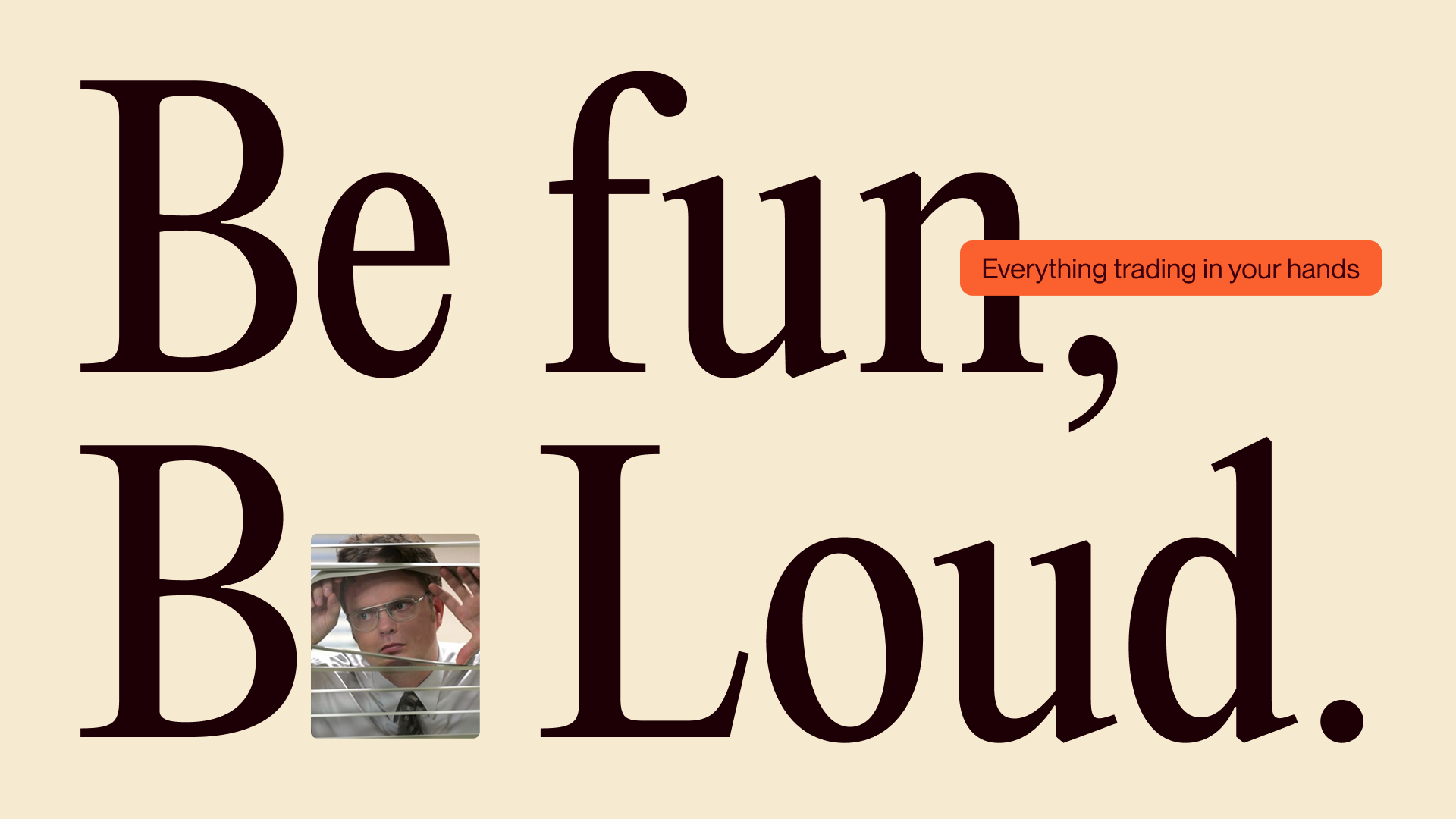
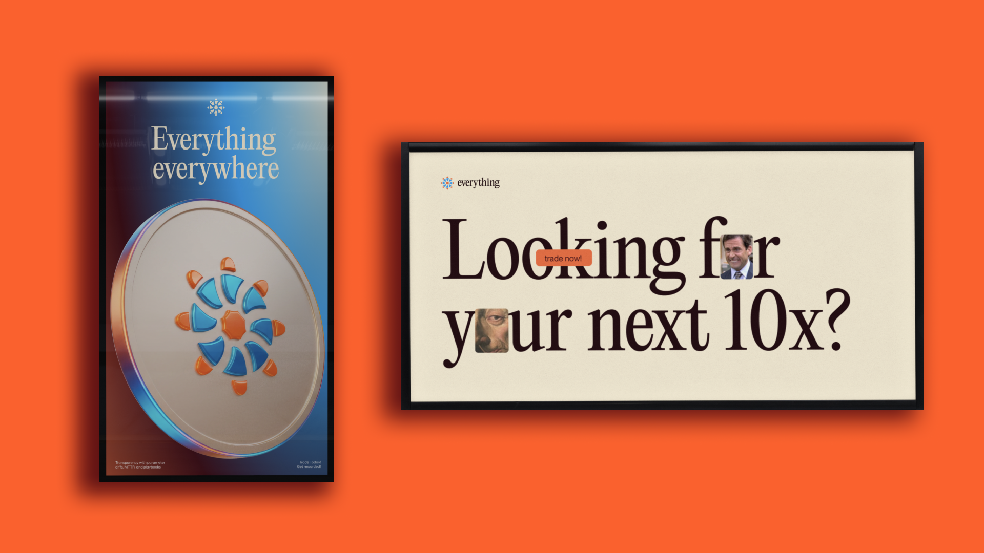
The primary creative asset is the meme — reframed as a legitimate design tool rather than an afterthought. Classic internet faces (the knowing glare, the scheming grin, the paranoid peek through the blinds) become structural elements within a rigorous framing system. They're not decorations dropped on top of a layout; they're compositional anchors.
The framing system itself — simple, mid, complex, outer — gives the brand a consistent visual grammar that can scale from a single social card to a full campaign. Memes sit inside these frames like portraits in a gilded frame. The juxtaposition is entirely deliberate, and it lands.
The "patching" technique extends this further: meme images and CTAs are treated like stickers or patches, bringing a tactile, collage-like energy to layouts while keeping them organised. Fun, but with structure underneath.
The guiding principle — Be fun, Be loud — isn't just a tagline. It's a design brief in three words.
Outcome
Everything.co launched and found its footing fast. The platform now moves over $3 million in daily trading volume, with a token launch in progress and an expanding presence across decentralised trading platforms. The brand is doing exactly what it was designed to do: making serious traders feel at home, while making the degen community feel seen.
When a brand works this well across two audiences this different, the identity isn't just decoration — it's strategy.
Related projects
Humanity Protocol
We guided Humanity from an early-stage startup to a fully funded, mature unicorn company
Warden Protocol
We gave Warden a proper brand slap. They took it all the way to $200 million.
BasedAi
BasedAI needed a brand as serious as their ambitions. We built it.
Nerwo
We built the home for Web3 freelancers. From the name up.
Slophy
Slophy didn't need a brand. It needed a universe. We built both.